
 All Services
  DevOps & Cloud
  UI/UX Design
  Mobile Development
  Development
Trade Bitcoin, Ethereum, and other digital currencies with up to 50X leverage from the comfort of your web3 wallet, such as Metamask or Coinbase Wallet - no need for a middleman!
Author: admin
Super productor
Client
Bonuz Inc
Services
Product Design
Mobile App Design
Web design
Timeline
2 years
The Challenge
❌ Main problem
Young musicians often face high fees on existing platforms, making it difficult to showcase their work without significant financial investment.
Additionally, many platforms prioritize established artists, which causes beginners to get lost in the background, making it challenging and costly to climb the career ladder.
Solutions
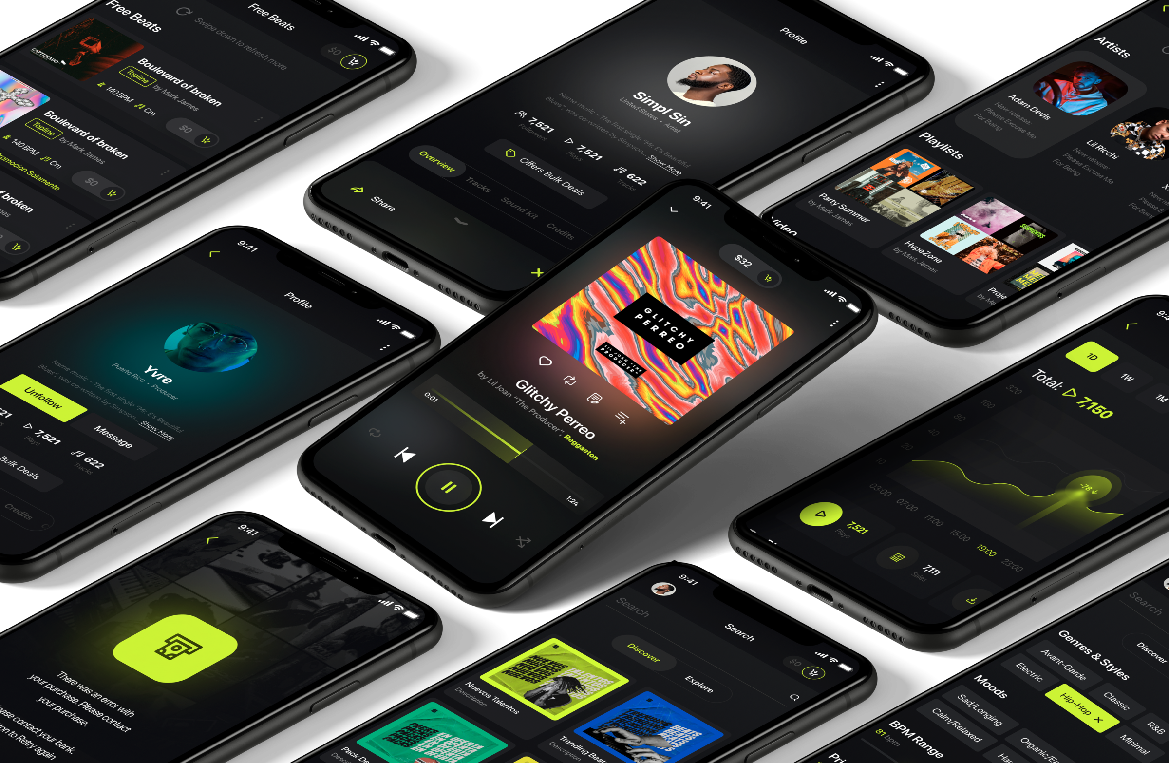
The platform aims to promote young musicians by offering an accessible, affordable environment where they can freely express their creativity. It focuses on minimizing costs, ensuring that new talent can thrive without being overshadowed by established artists, and provides tools to help them advance their careers.
✅ Cross-platform application
To enhance the overall aesthetic, we incorporated a captivating glow effect into our design, lending our pages a strikingly unconventional appearance reminiscent of scenes from futuristic sci-fi films.
✅ Problem Solve Solutions
To enhance the overall aesthetic, we incorporated a captivating glow effect into our design, lending our pages a strikingly unconventional appearance reminiscent of scenes from futuristic sci-fi films.
Research
During the research phase, I analyzed platforms like Tracklib, BeatStars, and Airbit. Each platform offers unique solutions for music creators, with Tracklib focusing on affordable sample licensing, BeatStars providing a marketplace for beats and collaborations, and Airbit offering an all-in-one solution for selling and promoting beats. However, all these platforms pose challenges for emerging artists, such as high fees or prioritizing well-established creators. The conclusion was to create Super Productor, a platform that minimizes costs and ensures visibility for new talent, making the creative process more accessible for young musicians.

Strengths
Unique Focus on Sampling: Tracklib specializes in licensed sample libraries, making it a go-to for producers looking to incorporate legal samples into their music.
Fair Pricing: Allows producers to affordably license classic and contemporary tracks for sampling.
Weaknesses
Niche Market: Focuses heavily on sampling, which narrows the user base compared to platforms that cater to more general beat production.
Strengths
Market Leader: BeatStars is one of the most popular platforms for buying and selling beats, with a massive user base.
Diverse Licensing Options: Offers both exclusive and non-exclusive licenses, attracting different types of customers.
Integrated Features: Provides seamless integration with social media, allowing producers to promote their beats across platforms.
Weaknesses
High Fees: The platform takes a percentage from beat sales, and there are additional transaction fees, which may discourage some sellers.
Complexity for New Users: The number of features can be overwhelming for first-time users.

Strengths
Easy-to-Use Interface: User-friendly design allows producers to upload, manage, and sell their beats effortlessly.
No Sales Fees: Unlike BeatStars, Airbit doesn’t charge commissions on sales (though there are payment processing fees).
Custom Storefronts: Producers can create their own personalized storefronts for selling beats.
Weaknesses
Limited Marketplace Presence: Smaller marketplace compared to BeatStars, meaning fewer opportunities for exposure.
Information architecture
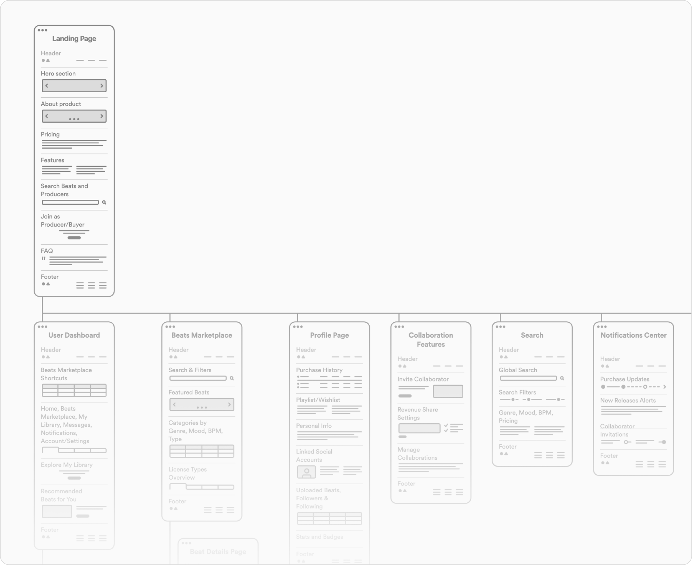
The information architecture was carefully designed to simplify navigation and ensure an intuitive experience for users. Key sections include a user dashboard, a marketplace for beats, profile management, collaboration features, and search functionality. This structure allows users to easily access tools and services, supporting their creative workflow and enhancing overall engagement on the platform.
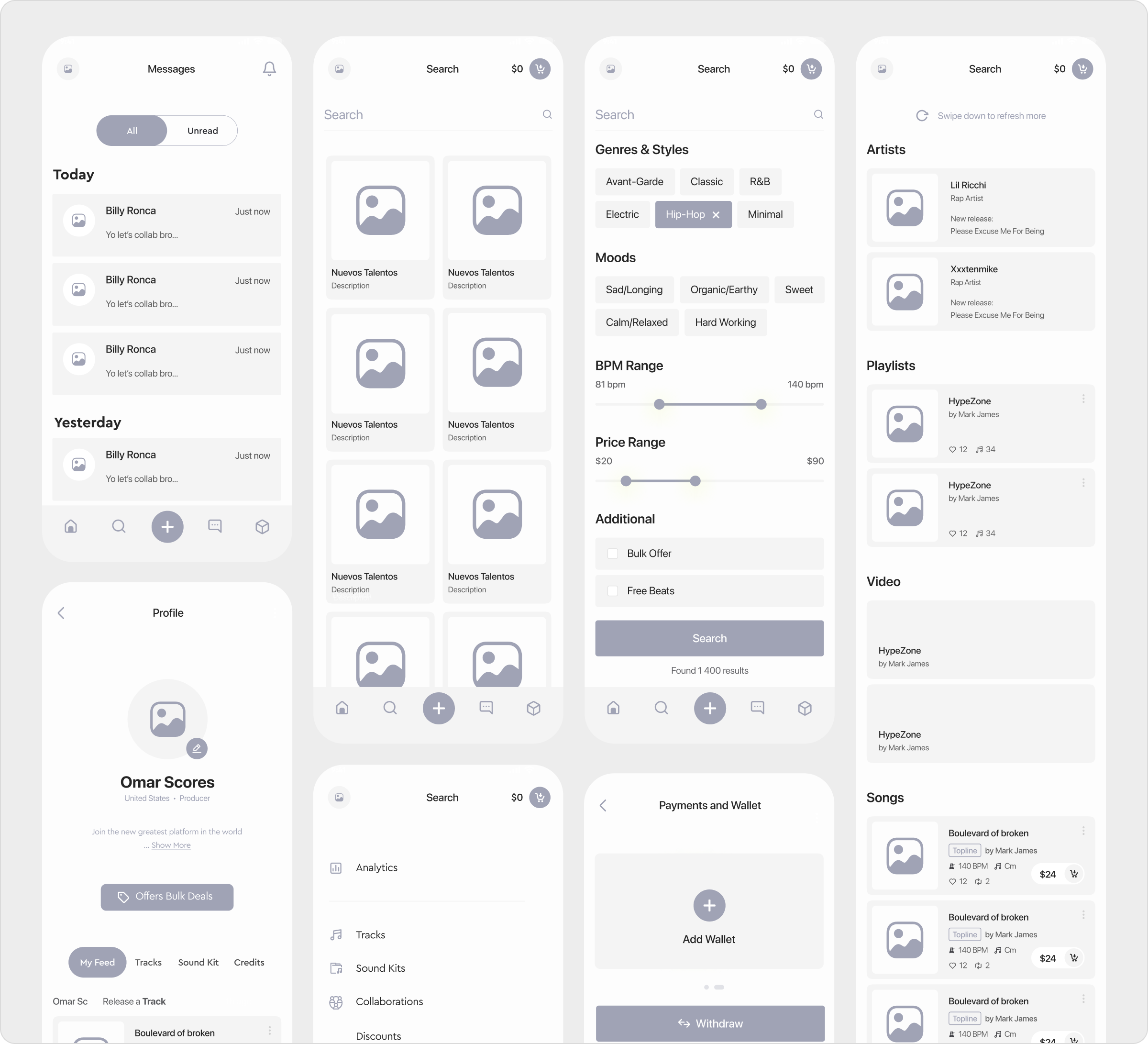
Low fidelity design
The low-fidelity designs focused on structuring the core functionality and user flow of the platform. These wireframes prioritize simplicity and clarity, allowing for quick iterations while outlining the main features such as messaging, search, profile management, and payment systems. This stage ensures that the fundamental user experience is intuitive and efficient before moving into higher-fidelity design stages.
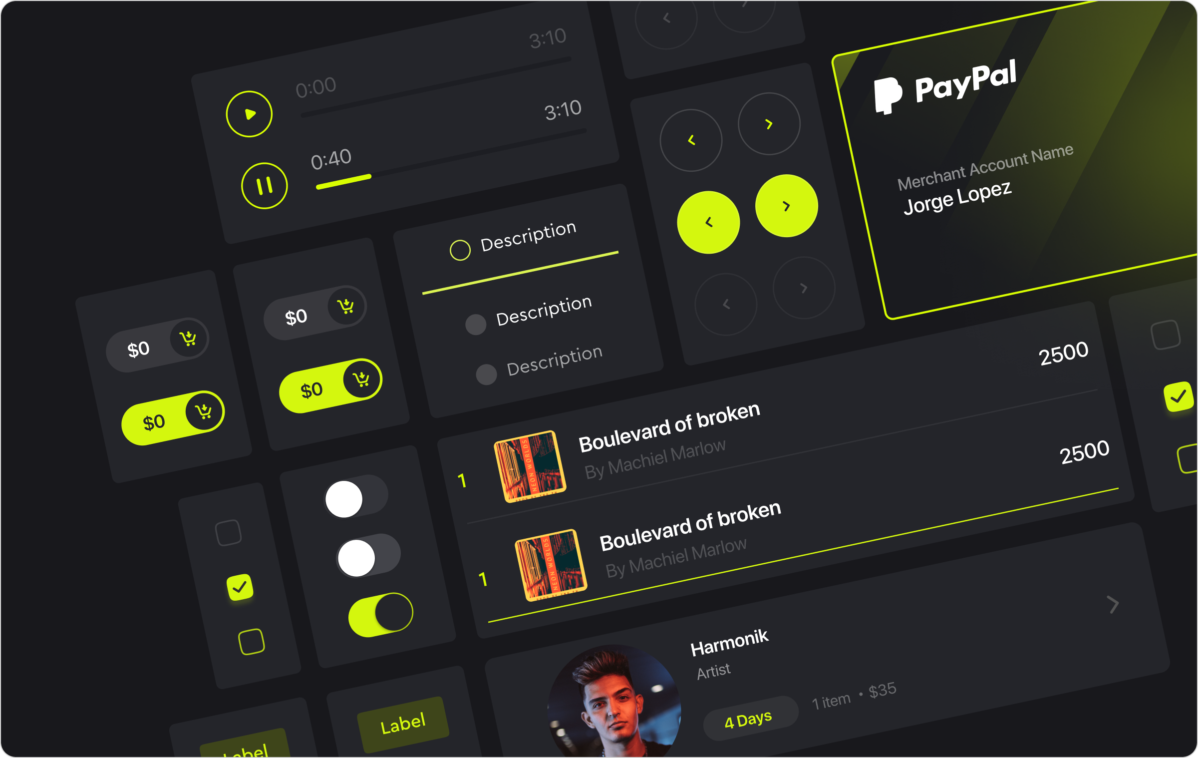
Design system
I developed a comprehensive Design System to ensure consistency across the platform, standardizing typography, color schemes, and spacing. This system improved scalability and facilitated faster prototyping, making collaboration with developers more efficient. The visual style embraces a bold, modern aesthetic with a dark theme accented by bright, vibrant colors. This approach highlights key interactive elements, creating a dynamic user experience that feels both professional and engaging.
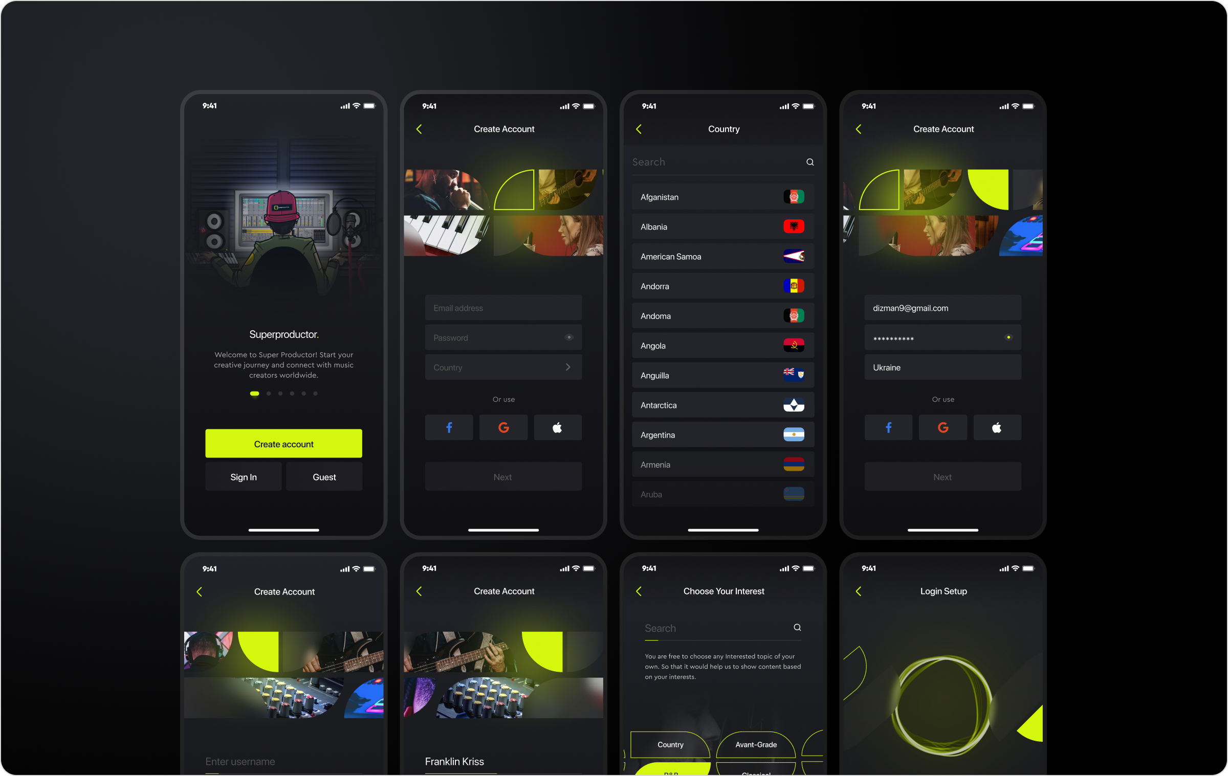
High fidelity design
The high-fidelity design phase focused on refining the visual details and interactions, transforming wireframes into polished, interactive interfaces. This stage involved finalizing the color schemes, typography, and layout, ensuring that the design was both aesthetically pleasing and functional. The result is a user experience that aligns with the platform’s goals, offering a seamless and engaging interface for music creators.
Onboarding process
The Super Productor onboarding flow provides a seamless and personalized setup experience, guiding users through account creation with email or social login options, selecting their role as a User, Artist, or Producer, choosing music genre preferences, and enabling secure biometric login for easy access, ensuring a smooth introduction to the platform.
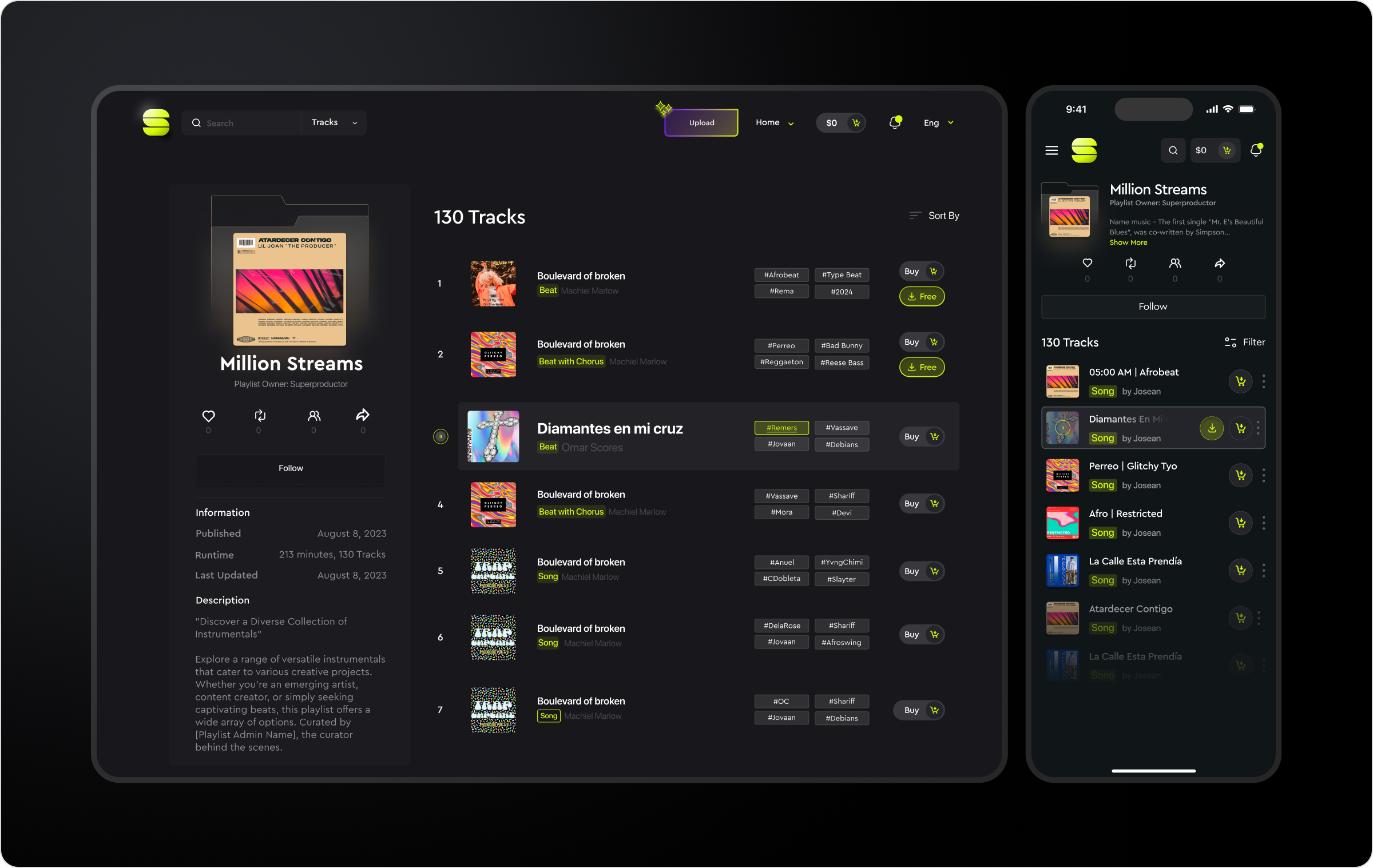
Personal Library
Playlist
The playlist feature allows users to explore a diverse collection of tracks, perfect for various creative projects. Whether you’re looking to enhance a video, complete a music production, or simply discover new beats, the playlist offers easy navigation and categorization by genre, style, and price. Users can follow playlists, purchase tracks, or filter by preferences, making it an essential tool for both artists and producers.
Analytics
Dashboard
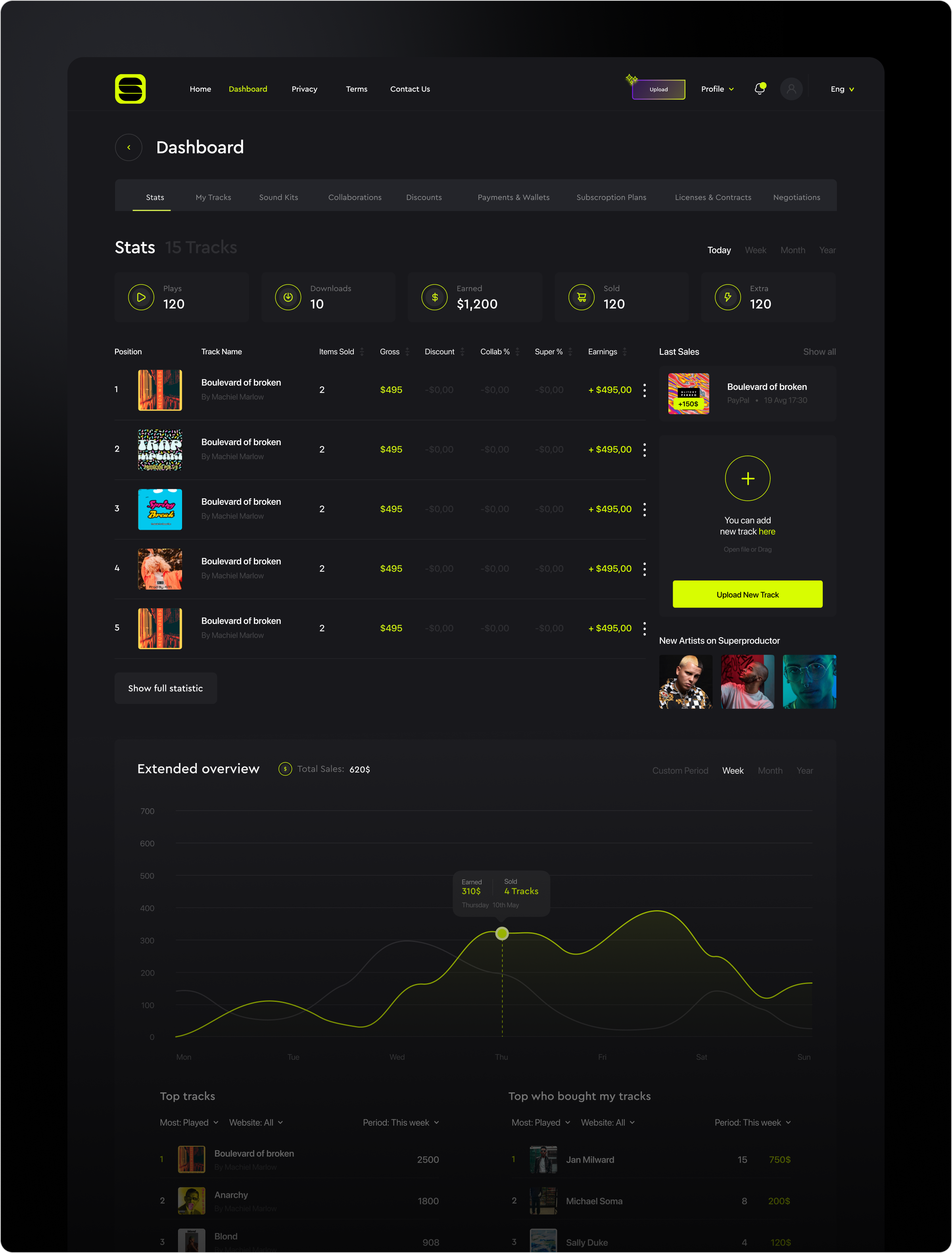
The dashboard offers an overview of your tracks, earnings, and sales performance. Users can easily monitor key metrics such as plays, downloads, and revenue, while tracking their top-performing tracks and most frequent buyers. With options to upload new tracks, manage collaborations, and view detailed sales statistics, the dashboard provides an intuitive interface to manage and optimize your music career efficiently. The extended statistics and graphs offer insights into performance trends, helping users make data-driven decisions to grow their audience.
Main
Landing page
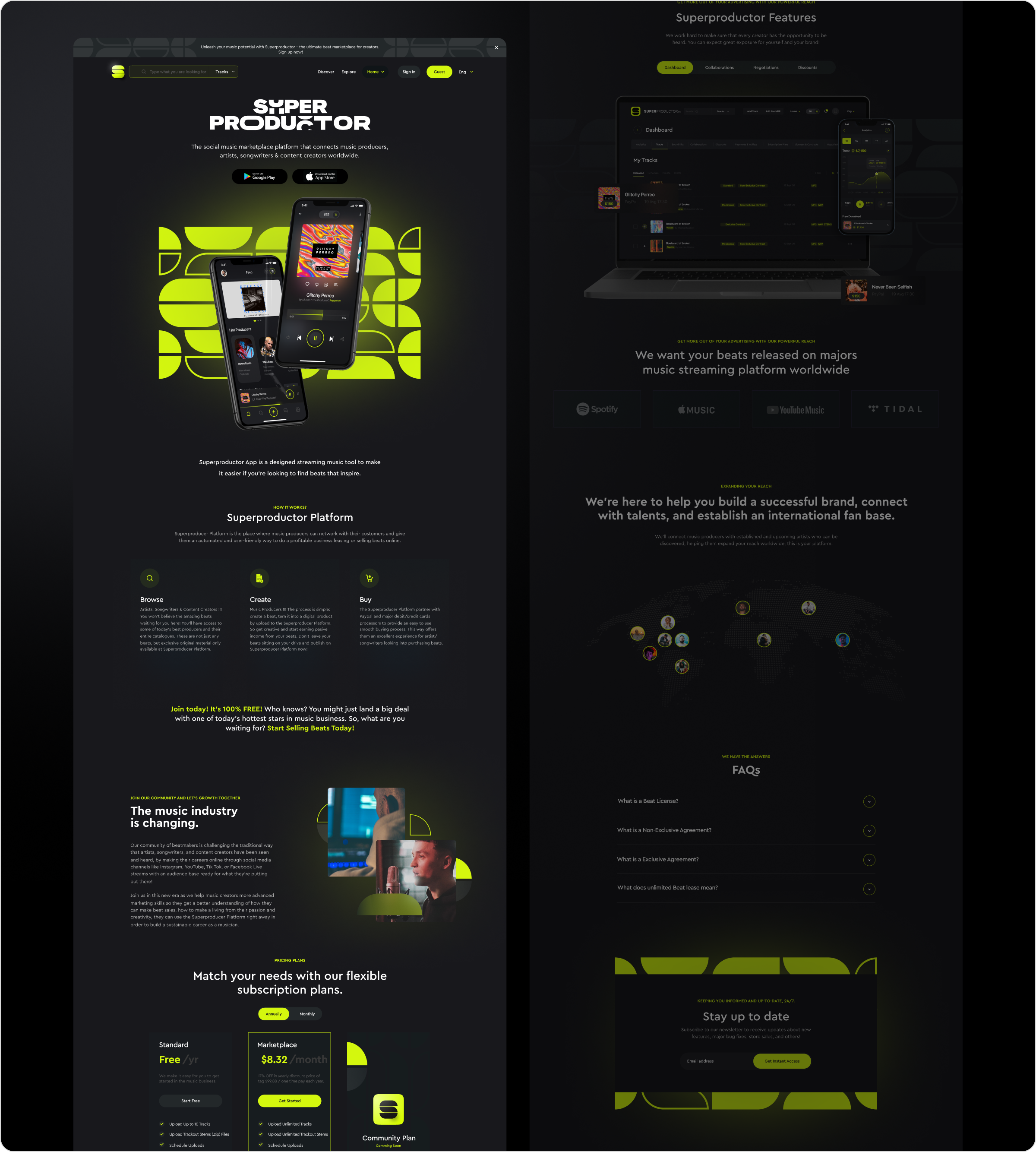
The landing page for Super Productor presents the platform as a social marketplace for music creators, showcasing its key features such as browsing, creating, and buying beats. It highlights the mobile app for easy access and seamless streaming, along with the dashboard for managing tracks and collaborations. The page emphasizes the opportunity for artists to release their beats on major platforms like Spotify, Apple Music, and Tidal. With a clear call to action, the landing page encourages users to join and start selling their beats, promising a chance to connect with talents and establish an international fan base.
Conclusion
Through my work on the Super Productor platform, I streamlined the user journey, from onboarding to account management, making it more intuitive and accessible for all users. By developing a consistent design system, refining the information architecture, and creating high-fidelity designs, I ensured that both artists and producers could easily connect, collaborate, and monetize their work. The platform now offers a seamless experience for emerging musicians, empowering them to expand their creativity and establish their brand in a competitive industry. My contributions helped bring a user-centric, visually engaging platform to life, paving the way for future growth and success.



Ez Carent
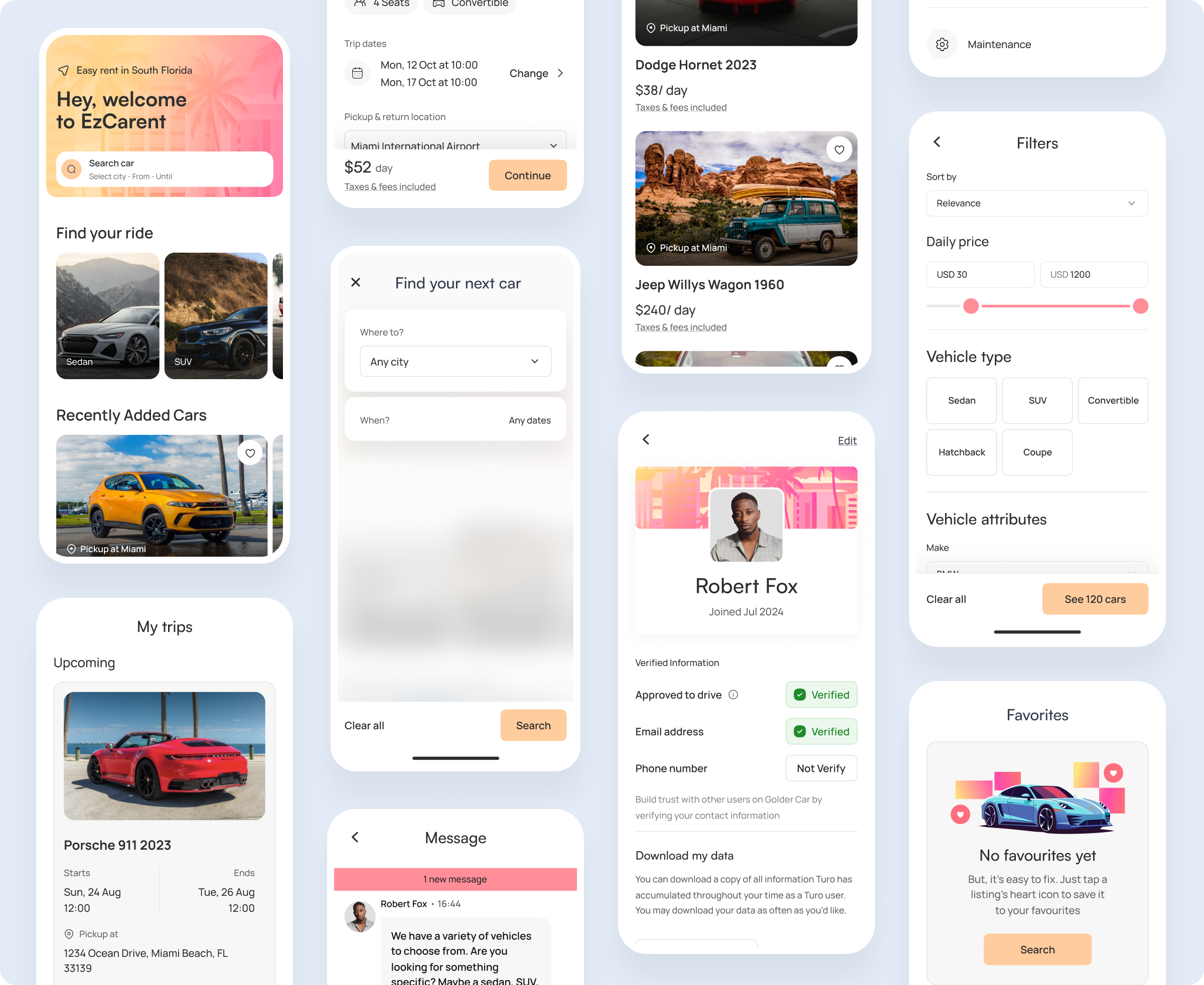
Ez Carent - It aims to streamline the entire rental process, making it faster and more accessible for users. With a focus on user-centric design and efficient booking, the project provides tools and features that simplify finding, reserving, and managing car rentals. The goal is to enhance the customer journey from start to finish, delivering a seamless and reliable car rental experience.
Client
Goldenluxcar
Services
Branding
Product Design
Development
Mobile Apps
Timeline
5 month
The Challenge
❌ Main problem
A client who owns a car rental business was struggling with third-party service platforms that imposed high commission fees, which significantly cut into his profitability after covering car maintenance and other operational expenses.
This became a critical challenge for his business, affecting revenue. Additionally, his loyal clients, many of whom are repeat renters, voiced frustration over the high fees charged by these third-party platforms. Renting vehicles through apps also proved inconvenient, especially for those interested in long-term rentals of a month or more.
Solutions
The primary goal was to create a proprietary platform that would allow the investor to retain more of the profits without the need to rely on external platforms like Turo. This would benefit not only the business but also loyal clients, offering them a more streamlined and cost-effective rental experience, particularly for long-term rentals.
✅ Cross-platform application
To enhance the overall aesthetic, we incorporated a captivating glow effect into our design, lending our pages a strikingly unconventional appearance reminiscent of scenes from futuristic sci-fi films.
✅ Problem Solve Solutions
To enhance the overall aesthetic, we incorporated a captivating glow effect into our design, lending our pages a strikingly unconventional appearance reminiscent of scenes from futuristic sci-fi films.
Research
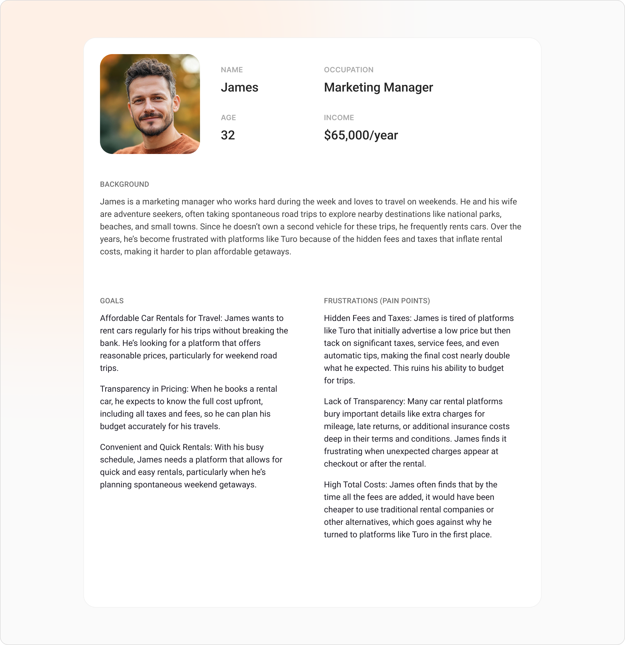
To create this user persona, we conducted a combination of qualitative interviews and online surveys with frequent car renters, traditional rental companies, and ride-sharing services. Participants, including professionals who travel regularly for work and leisure, were asked about their experiences, frustrations, and needs regarding car rentals. Key insights came from understanding pain points related to hidden fees, taxes, and unclear rental terms, which led to developing a persona that accurately reflects the concerns of individuals like James. Additionally, we analyzed customer reviews and complaints from popular rental platforms to further validate the identified issues and inform the development of this persona.
Competitor analysis

Strengths
Well-established peer-to-peer car rental platform with a wide variety of vehicle options and a large user base. Offers convenient mobile app and flexibility for both renters and owners.
Weaknesses
Common complaints include high taxes, hidden fees, and inconsistent pricing, which often frustrate users, especially frequent renters.

Strengths
Provides instant car rentals with keyless entry technology, allowing renters to unlock cars directly through the app. Focuses on short-term, flexible rentals in urban areas.
Weaknesses
High insurance fees and additional costs often confuse users, and the platform has been criticized for limited car availability in some locations.

Strengths
Trusted, established brand with clear pricing structures and a wide range of vehicles available at airports and city locations. Offers loyalty programs for frequent renters.
Weaknesses
Tends to be more expensive upfront, with rigid rental terms and additional fees for younger drivers or late returns, which limits flexibility compared to peer-to-peer platforms.
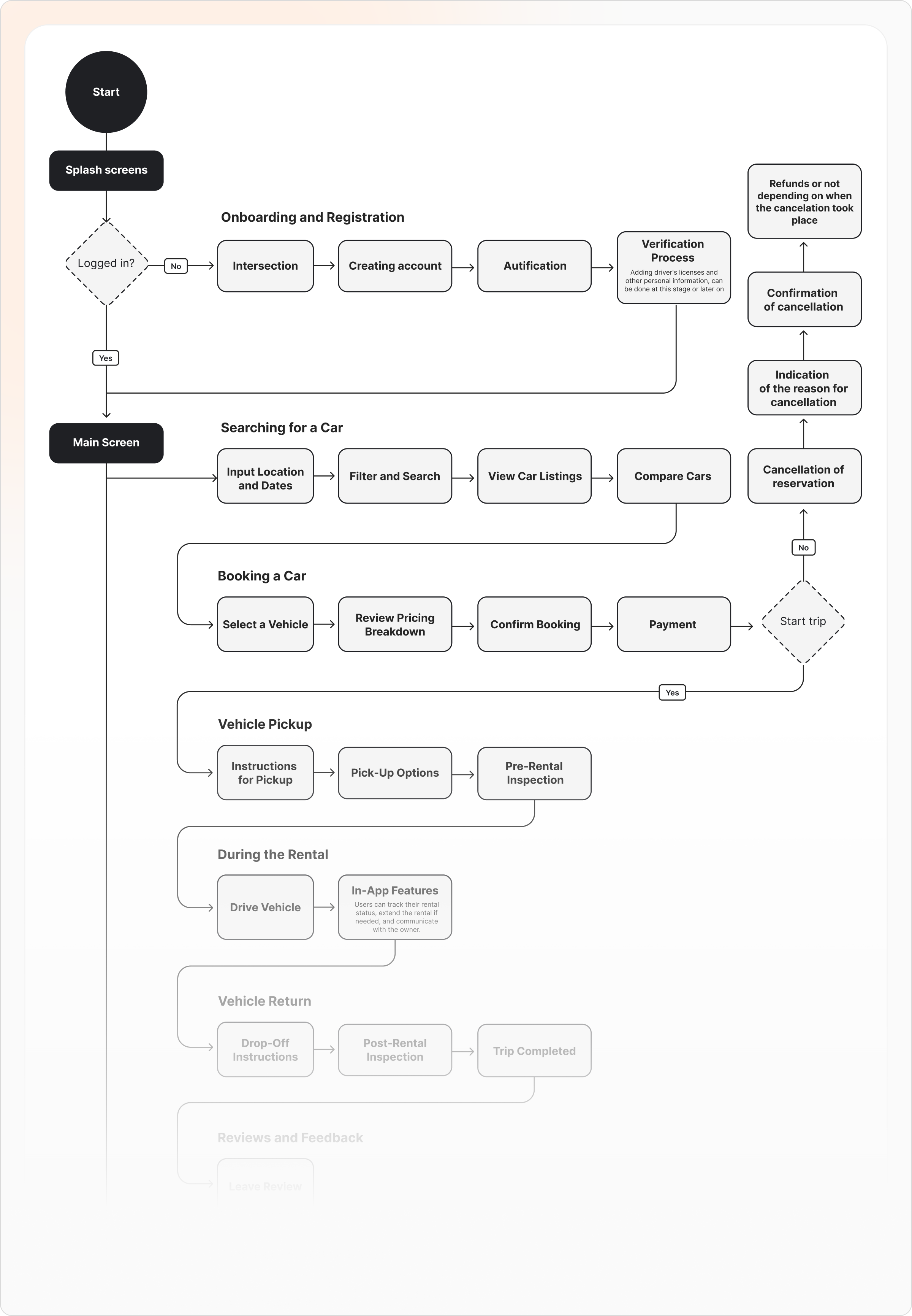
User flow
This user flow outlines the step-by-step process from the initial splash screen through onboarding, registration, and verification, leading to the completion of a car rental. The goal is to create a smooth and user-friendly experience, ensuring that each step is intuitive and efficient, minimizing friction for new and returning users.
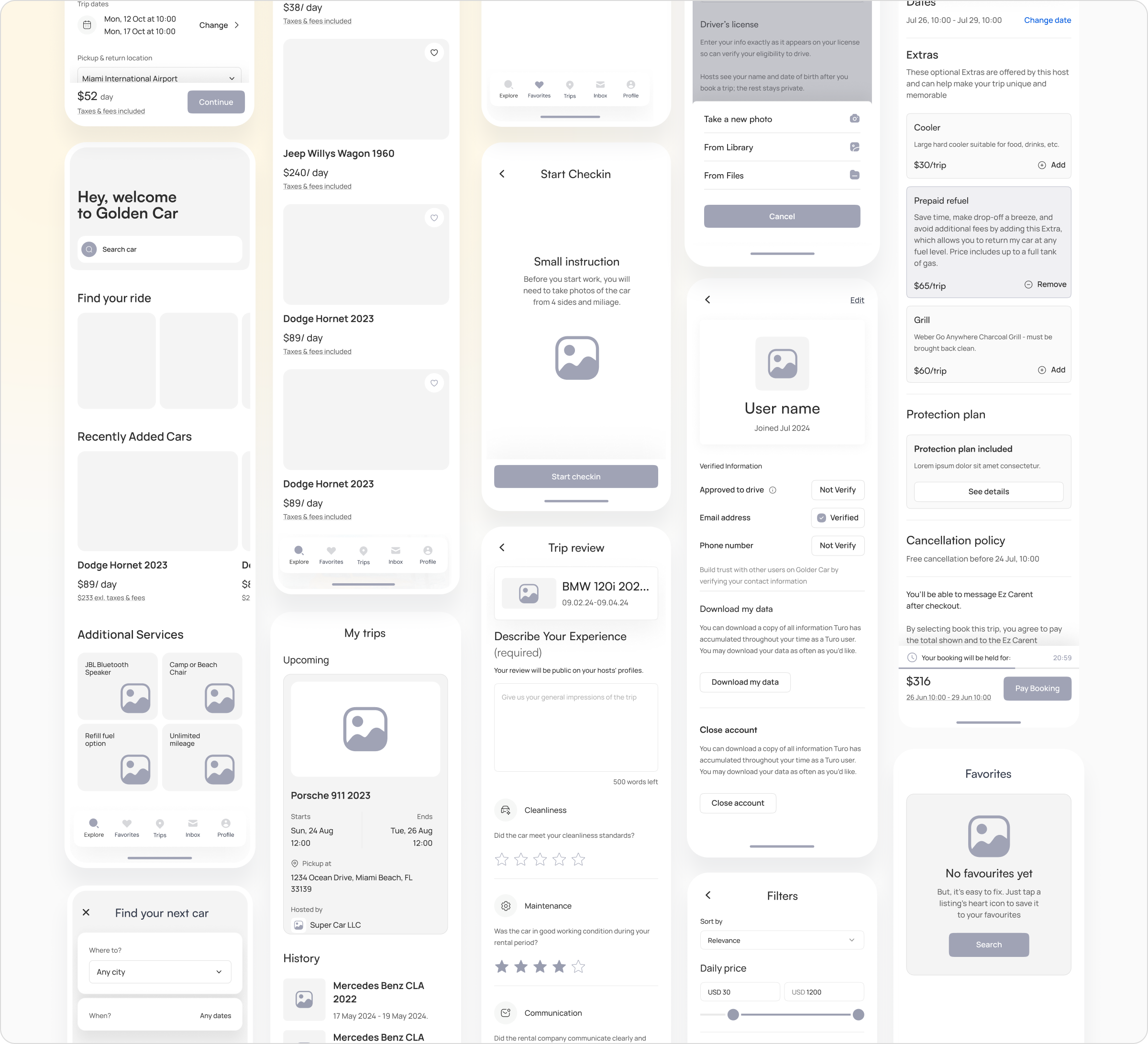
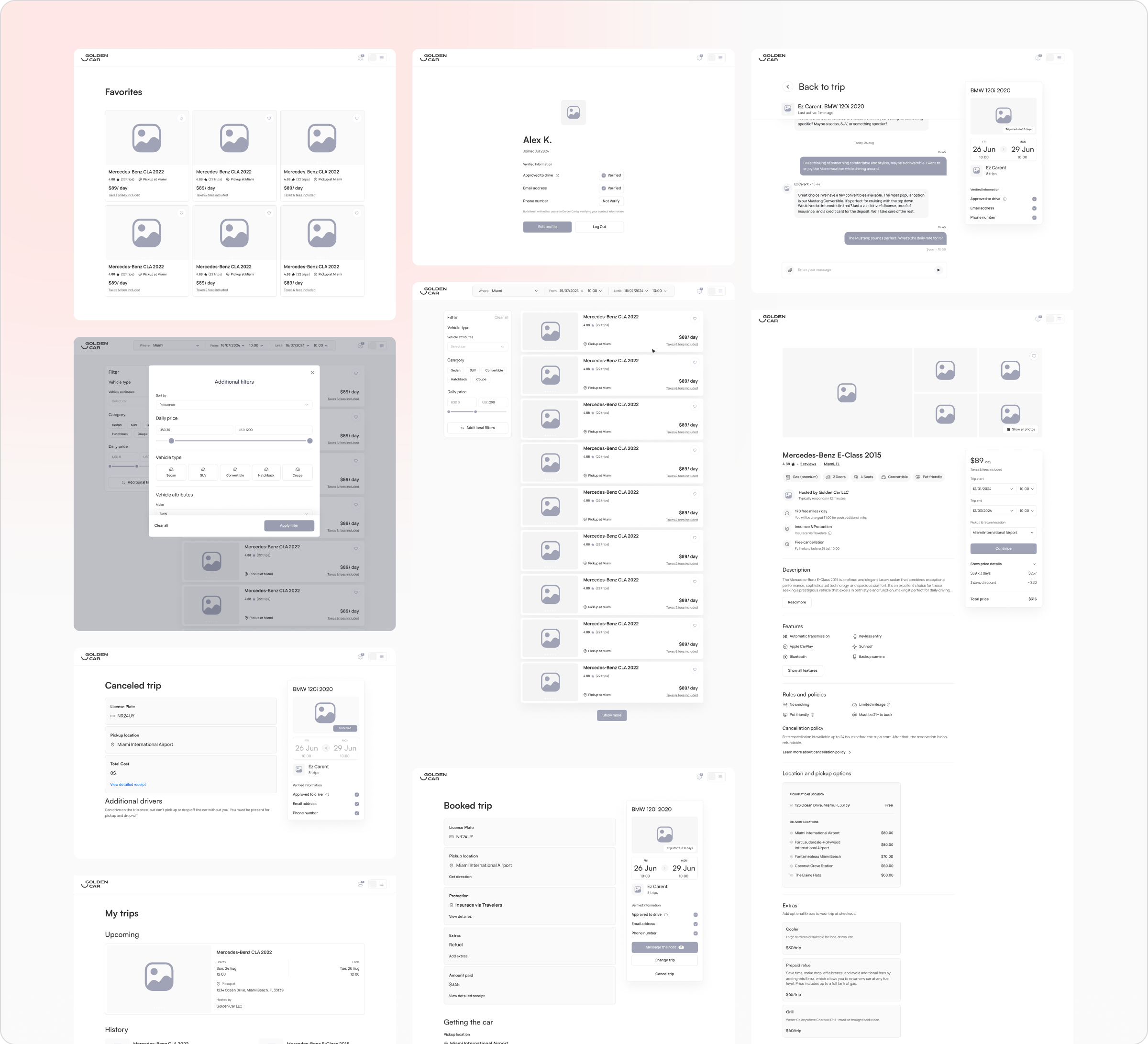
Low fidelity design
The low fidelity wireframes for the mobile application highlight the key screens and user interactions within the car rental platform. These wireframes focus on the core functionalities, including browsing available vehicles, managing bookings, and completing the check-in process. The design ensures that all essential information is easily accessible, providing a clear and intuitive experience for users as they navigate through the app.
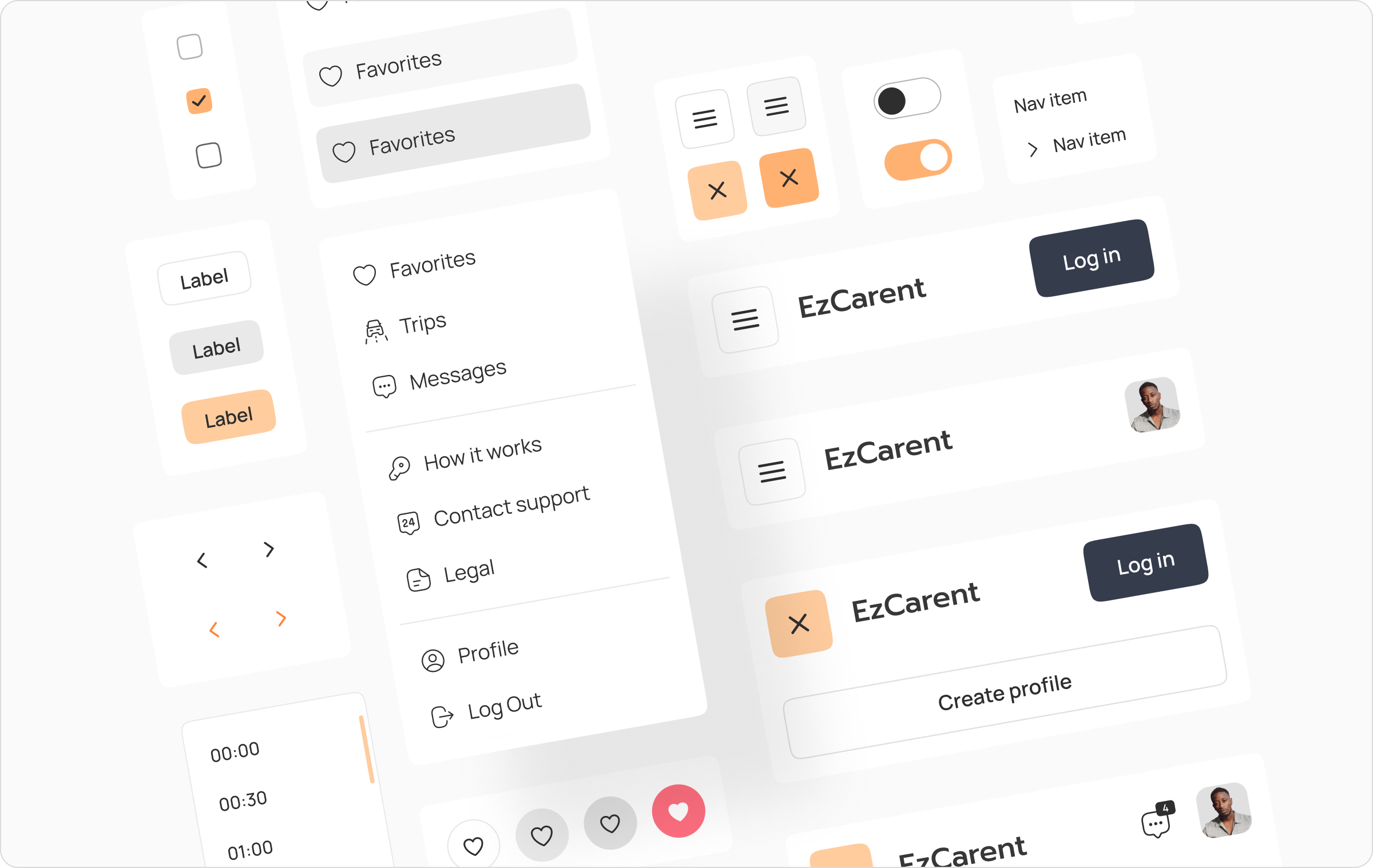
Design system
The design system establishes the visual and functional framework for the entire car rental platform. It includes a consistent set of UI components, typography, color palettes, and iconography, ensuring a cohesive and intuitive user experience across the web and mobile applications. The system promotes efficiency in design and development, allowing for rapid prototyping and scaling while maintaining brand consistency.
High fidelity design
We crafted over 80 screens for the mobile and web versions of the platform, ensuring a polished and cohesive user experience. These screens are optimized for usability and aesthetic appeal, providing a seamless journey from browsing cars to completing a rental.
Onboarding process
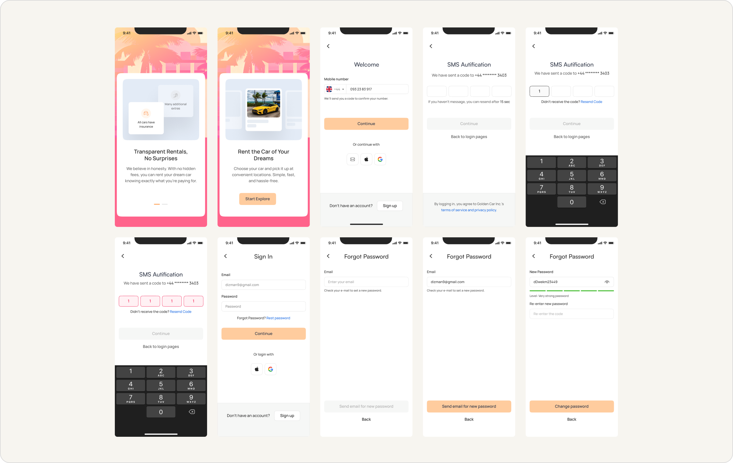
The onboarding process was designed to ensure a smooth and intuitive entry for users into the platform. It includes key steps such as signing up, SMS authentication, and password recovery, all crafted to provide a seamless experience. With a focus on user-friendly design and clear instructions, the onboarding flow helps users quickly and efficiently get started, rent cars, and manage their profiles, while ensuring secure and transparent interactions.
Search process
Car search
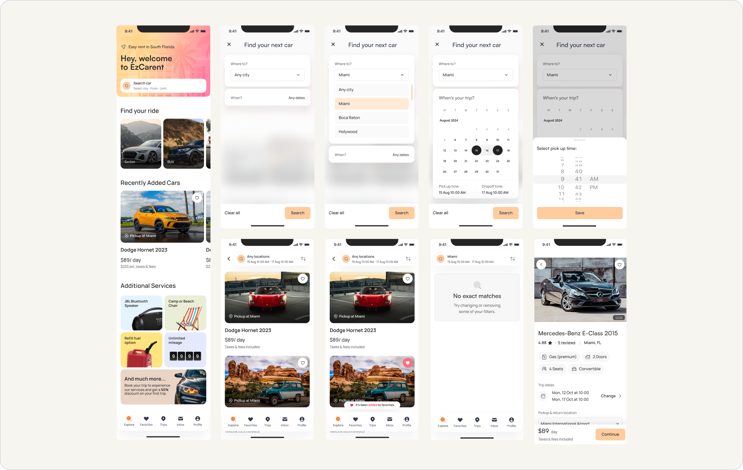
The car search process is designed to be flexible and user-friendly, allowing users to easily find their desired vehicle. Users can filter their search by location, date, and time, ensuring they get the most relevant results. The system also provides clear options for additional services and features detailed car listings, including pricing and availability. Whether searching for a short-term rental or an extended trip, this process ensures that users can quickly locate and book the perfect vehicle for their needs.

Cross platform
Web application
The design is optimized for a larger screen, providing a clear and intuitive user experience while maintaining consistency with the mobile version. Users can easily access their trip details, chat with support, and handle any modifications to their bookings with ease.

Conclusion
We worked at a rapid pace, successfully designing the entire platform in just two months. Every morning, we held meetings with developers and managers to ensure alignment and address any dependencies. This close collaboration with the development team allowed us to quickly iterate and deliver a large number of screens for the desktop, responsive, and mobile applications. The team’s ability to adapt and communicate efficiently was key to our success, ensuring the platform met all functional and design requirements within the tight timeline.
Decentralized Perpetual Exchange
Trade Bitcoin, Ethereum, and other digital currencies with up to 50X leverage from the comfort of your web3 wallet, such as Metamask or Coinbase Wallet - no need for a middleman!
Client
Dpex.io
Services
Website
Branding
Webflow
DEX
Timeline
2 week
The Challenge
❌ Overcoming Design Monotony in Decentralized Exchanges
The decentralized exchange space is filled with platforms that look overly templated, leading to a lack of user trust and engagement. Our challenge was to break this design monotony by crafting a visually unique and engaging interface that would immediately stand out.
Solutions
Our solution for the DPEX project involved creating a complete brand identity from the ground up, including the development of a website and platform design. Starting with no existing branding, we crafted a unique visual identity that reflects the innovative and trustworthy nature of DPEX. We designed and built a sleek, modern website on Webflow, ensuring a fully responsive and user-friendly experience. The platform design incorporated futuristic elements and an engaging aesthetic to set DPEX apart in the decentralized exchange space.
✅ Dashboard
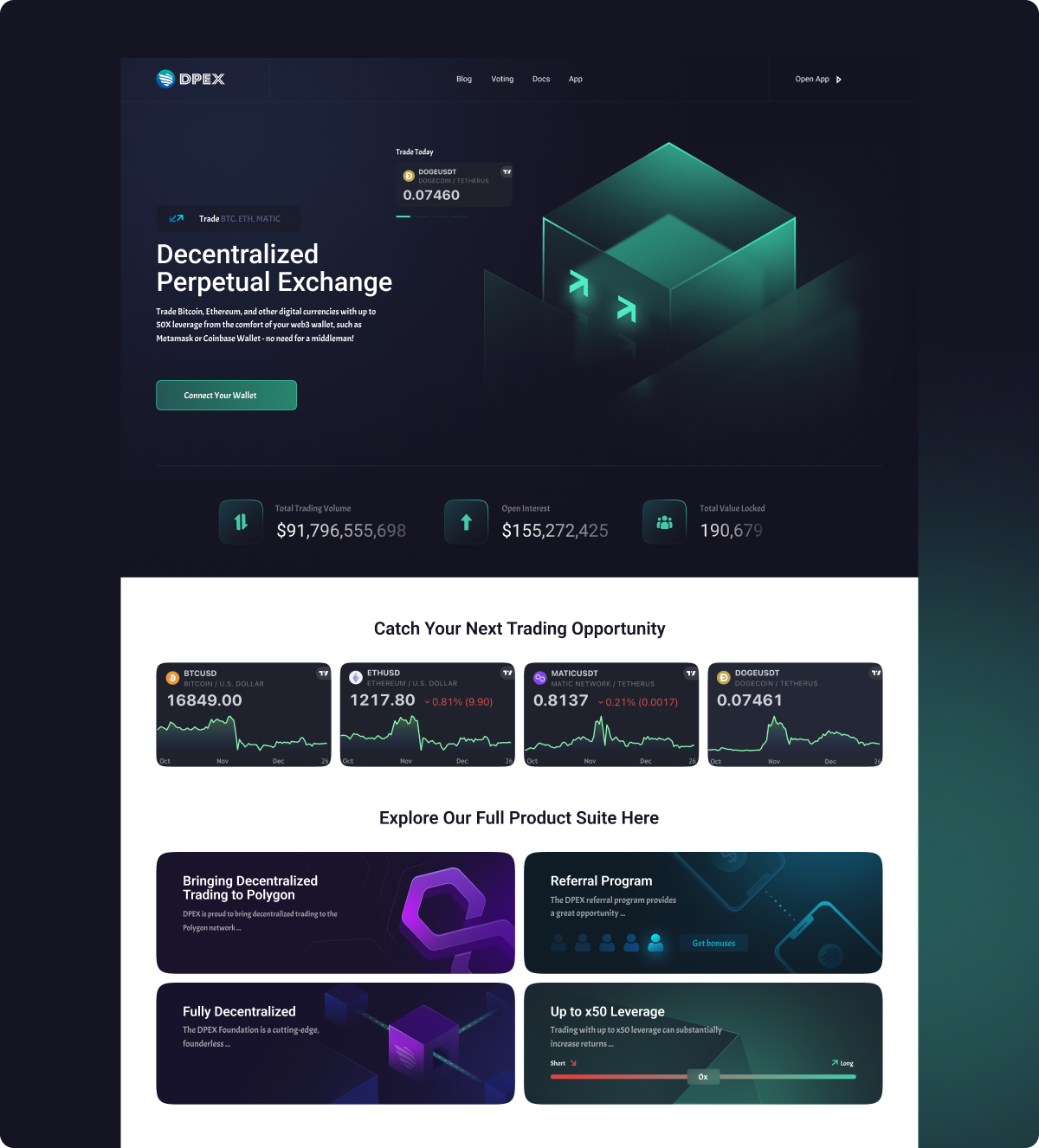
We designed a user-friendly, visually engaging interface for the DPEX trading platform, providing seamless access to essential tools and real-time market data. Key features like the leverage slider and intuitive navigation enhance usability, offering a streamlined experience that aligns with the platform’s innovative approach.
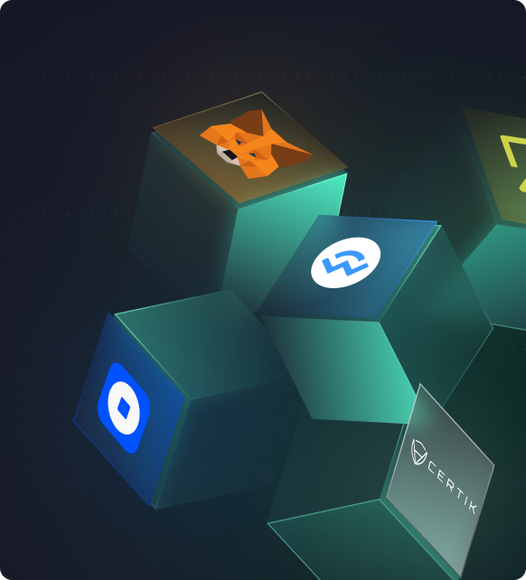
✅ Website
We created a complete brand and website for DPEX, focusing on an intuitive structure, valuable information, and a standout design. The website’s layout was carefully crafted to guide users seamlessly, making it easy to find essential details and understand the platform’s value. With a modern and unique visual style, DPEX’s brand now stands out in the decentralized exchange space, building trust and engagement through both design and functionality.
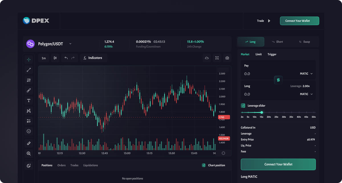
Dex dashboard
We spent 18 days researching competitors, creating the first concepts, designing the entire site and development. All deadlines are negotiated and approved in advance with the client.
Conclusion
In the DPEX project, we created a complete brand direction from scratch, developing a unique website design and building the site on Webflow to ensure full responsiveness across all devices. Additionally, we designed the trading platform interface, focusing on an intuitive, user-friendly experience. The result is a cohesive brand presence that stands out in the decentralized exchange market, combining a visually engaging, fully adaptive website with a functional and professional platform that meets the needs of its users.
High Performance. Fully Manages System
Packet Rabbit is a cutting-edge technology company specializing in dedicated hardware solutions, offering instant deployment and colocation services across a network of over 5 interconnected data centers spanning North America and Europe.
Our objective was to craft a cutting-edge and contemporary design that truly embodies the essence of our company's mission. Opting for a palette of vibrant purple and blue hues, we sought to convey a sense of modernity, scientific curiosity, and the quest for exploration.
Client:
Packet Rabbit
Services:
Product Design
Branding
Webflow
Time line:
1 month

The Challenge
❌ Not intuitive design
The design was originally developed by a team of developers. The site does not stand out against the background of other sites in the industry, which greatly affects the memorization and most importantly the conversion rate of the site.
❌ Not properly pitching the business
Non-intuitive stucture and description of business direction affects conversion and search engine indexing of the page. The content should provide a clear idea for the potential customer.
Solutions
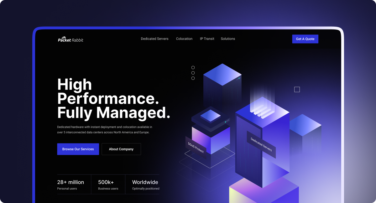
We undertook a comprehensive redesign for Packet Rabbit, establishing a fresh, distinctive brand direction and an intuitive new interface. Our team focused on creating a visually compelling, user-centered experience that clearly communicates the business model and values of Packet Rabbit.
Through thoughtful design and a streamlined structure, we enhanced both usability and engagement. The new website integrates modern aesthetics with a professional tone, representing Packet Rabbit as a leader in managed server solutions. This transformation reflects the dedication to excellence that went into every design decision, solidifying a bold and cohesive brand identity.
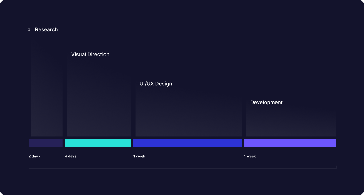
Project Timeline
The project began with thorough research over two days, allowing us to understand the market, target audience, and key business goals. We then spent four days establishing a unique visual direction to create a cohesive and appealing brand style. Building on this foundation, we dedicated a week to UI/UX design, crafting an intuitive and engaging user experience that aligned with brand aesthetics. In the final week, we moved to development, transforming the designs into a seamless, responsive interface for users across all devices.
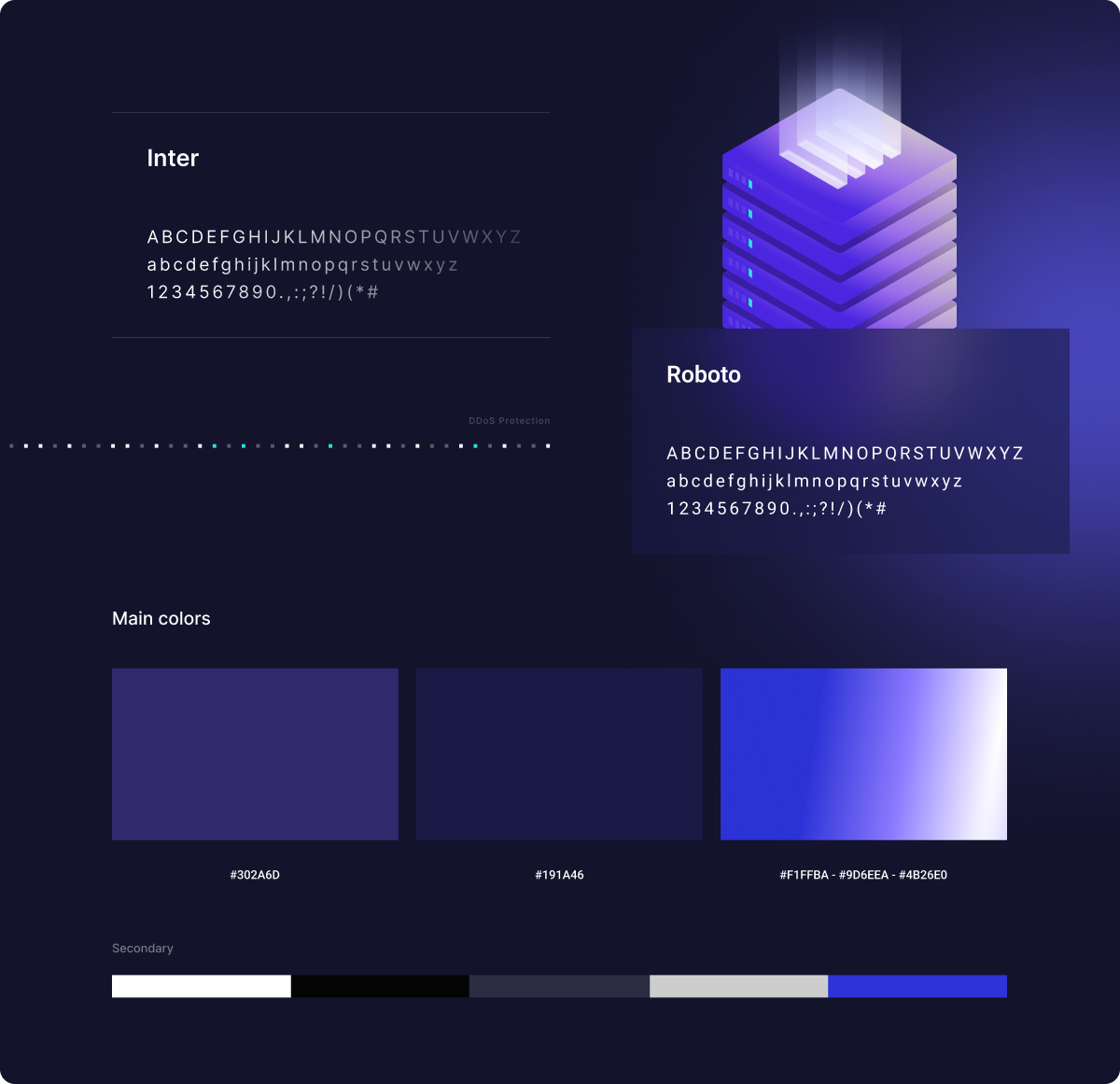
Style Guide
We developed a comprehensive style guide to ensure consistency and ease of use across all brand touchpoints. Featuring carefully selected fonts, a cohesive color palette, and design elements, this guide serves as a practical resource for maintaining a unified brand identity. By defining clear visual standards, we’ve made it easy for the team to create cohesive, on-brand content that enhances recognition and delivers a polished experience to users.
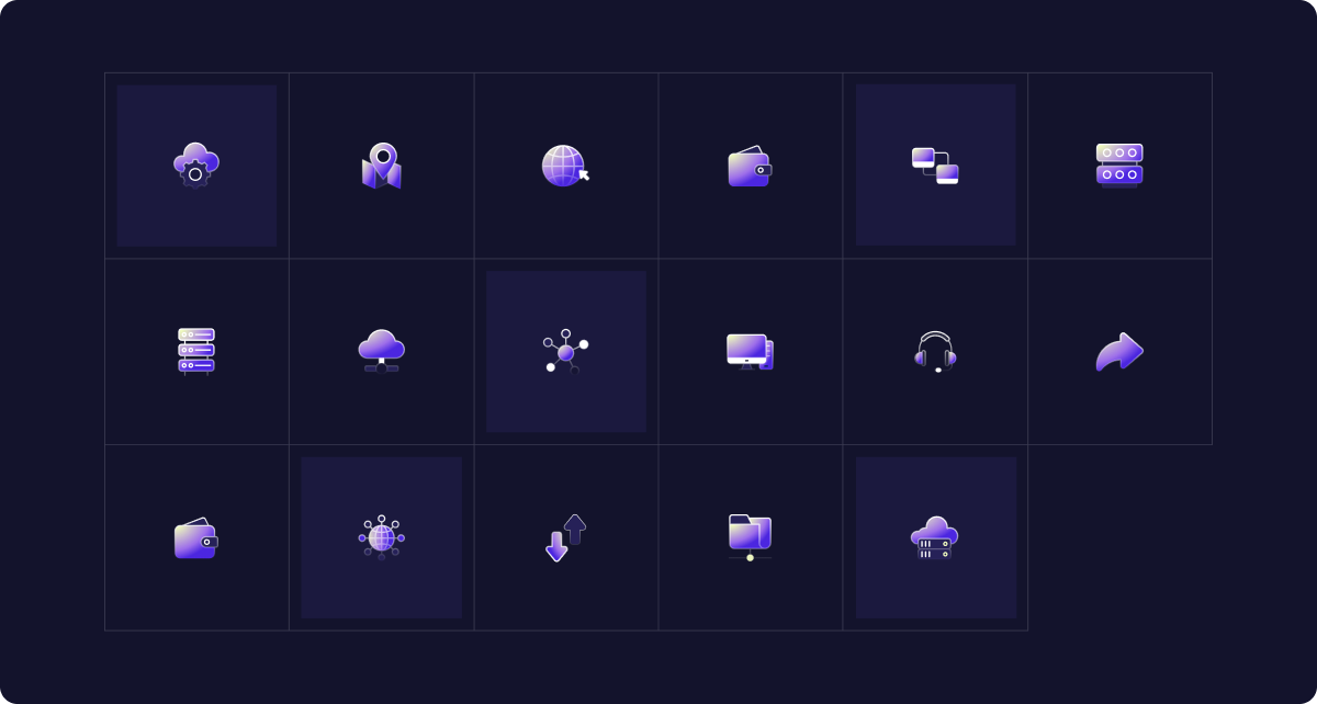
Iconography
We created a unique set of icons tailored specifically to enhance the brand’s visual identity. Each icon was designed with attention to detail, aligning perfectly with the overall style and tone of the brand. This custom icon set not only adds a cohesive, polished look to the design but also improves user experience by providing clear, intuitive visual cues. These icons are an integral part of the brand’s identity, reinforcing consistency across all digital and print materials.

Main page
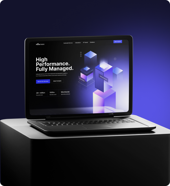
We developed a unique homepage design that effectively communicates the company’s focus on high performance and managed services. The intuitive layout guides users smoothly, enabling them to access relevant information effortlessly. Modern visual elements and fluid transitions enhance the user experience, making the interface both engaging and easy to navigate.
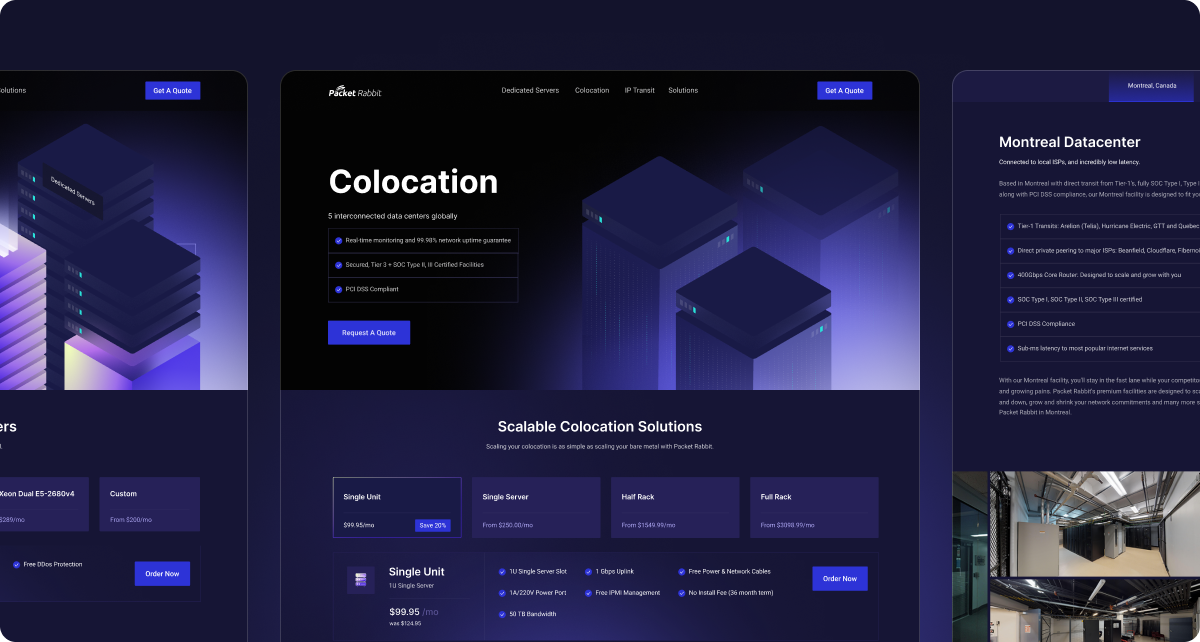
Additional Pages
The design aligns with modern trends, prioritizing clean aesthetics and ease of navigation across all pages. Each element is strategically placed to guide users naturally through the content, creating a seamless browsing experience. The emphasis on intuitive navigation ensures that users can access information quickly and effortlessly, enhancing overall usability while maintaining a visually appealing, contemporary interface.
Responsive design
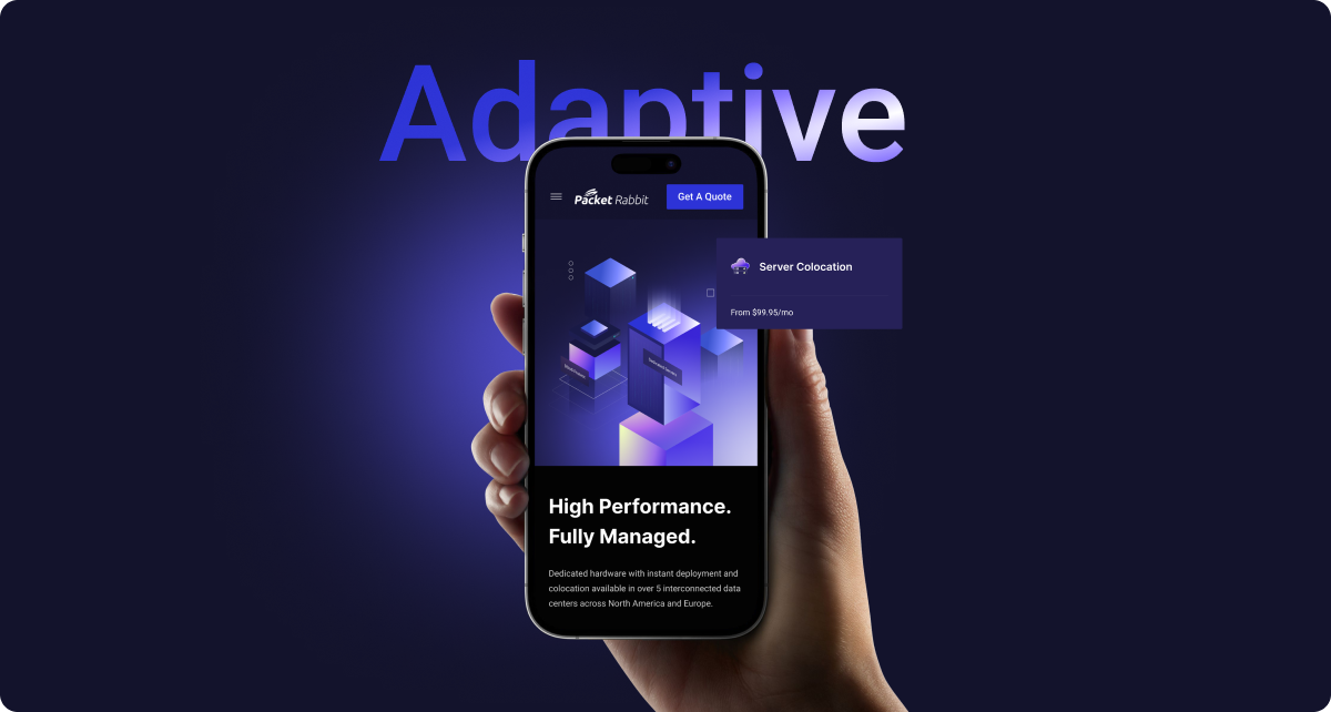
The design is fully responsive, adapting seamlessly to any device. This adaptability is crucial, as many users now rely on their mobile phones for quick access. By optimizing the layout and functionality for various screen sizes, we ensure a smooth and intuitive experience, whether users are on a smartphone, tablet, or desktop.

Conclusion
We developed an intuitive page design and crafted a user-friendly structure to facilitate easy navigation, ensuring users can find all necessary information as quickly as possible. Since the brand lacked a distinctive style, we proposed a refreshed brand experience by incorporating modern, trendy design elements and graphics. This approach not only enhances usability but also differentiates the brand from similar products, giving it a unique visual identity that stands out in the market.