
 All Services
  DevOps & Cloud
  UI/UX Design
  Mobile Development
  Development
Ez Carent - It aims to streamline the entire rental process, making it faster and more accessible for users. With a focus on user-centric design and efficient booking, the project provides tools and features that simplify finding, reserving, and managing car rentals. The goal is to enhance the customer journey from start to finish, delivering a seamless and reliable car rental experience.
Ez Carent
Client
Goldenluxcar
Services
Branding
Product Design
Development
Mobile Apps
Timeline
5 month

The Challenge
❌ Main problem
A client who owns a car rental business was struggling with third-party service platforms that imposed high commission fees, which significantly cut into his profitability after covering car maintenance and other operational expenses.
This became a critical challenge for his business, affecting revenue. Additionally, his loyal clients, many of whom are repeat renters, voiced frustration over the high fees charged by these third-party platforms. Renting vehicles through apps also proved inconvenient, especially for those interested in long-term rentals of a month or more.
Solutions
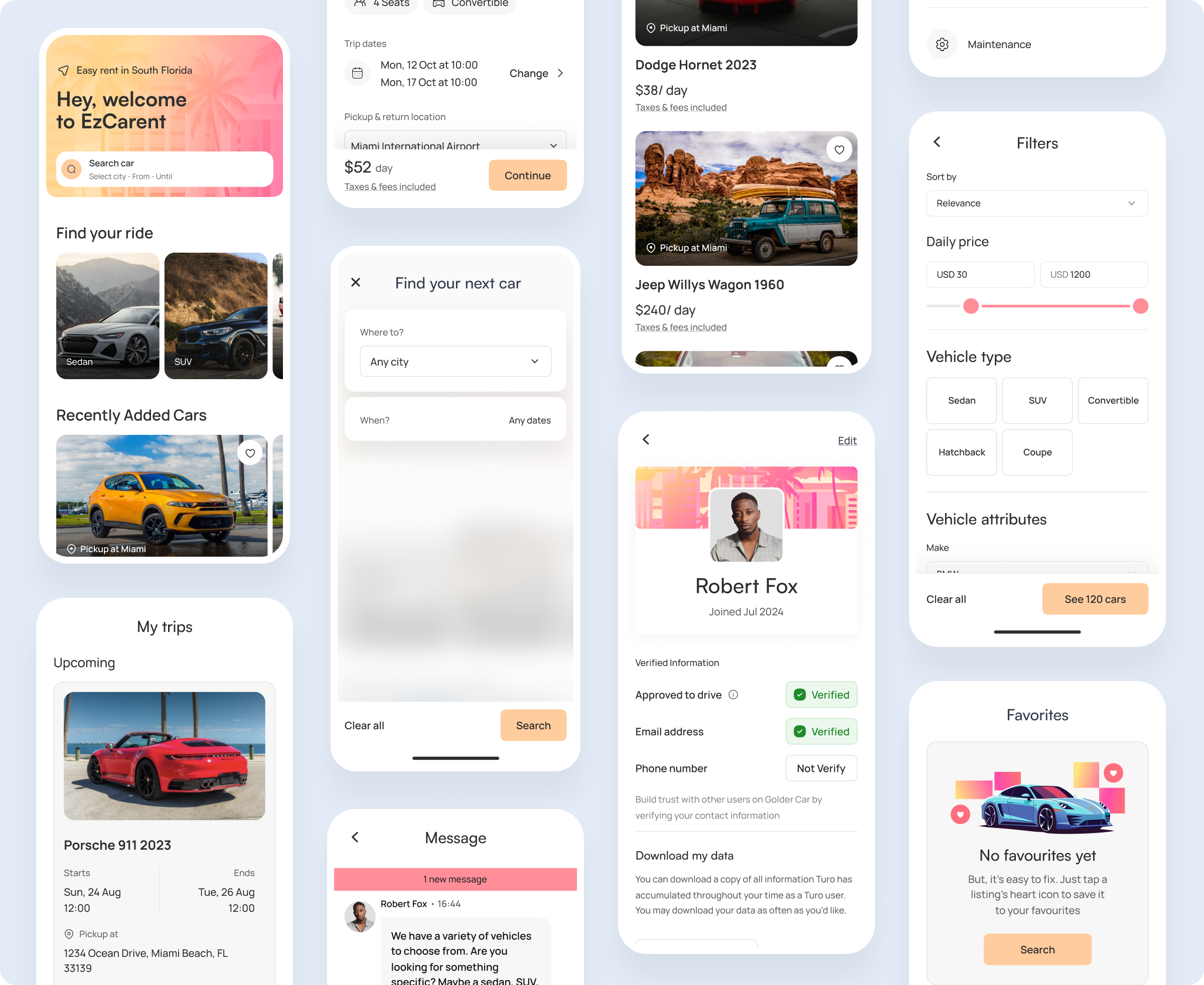
The primary goal was to create a proprietary platform that would allow the investor to retain more of the profits without the need to rely on external platforms like Turo. This would benefit not only the business but also loyal clients, offering them a more streamlined and cost-effective rental experience, particularly for long-term rentals.
✅ Cross-platform application
To enhance the overall aesthetic, we incorporated a captivating glow effect into our design, lending our pages a strikingly unconventional appearance reminiscent of scenes from futuristic sci-fi films.
✅ Problem Solve Solutions
To enhance the overall aesthetic, we incorporated a captivating glow effect into our design, lending our pages a strikingly unconventional appearance reminiscent of scenes from futuristic sci-fi films.
Research
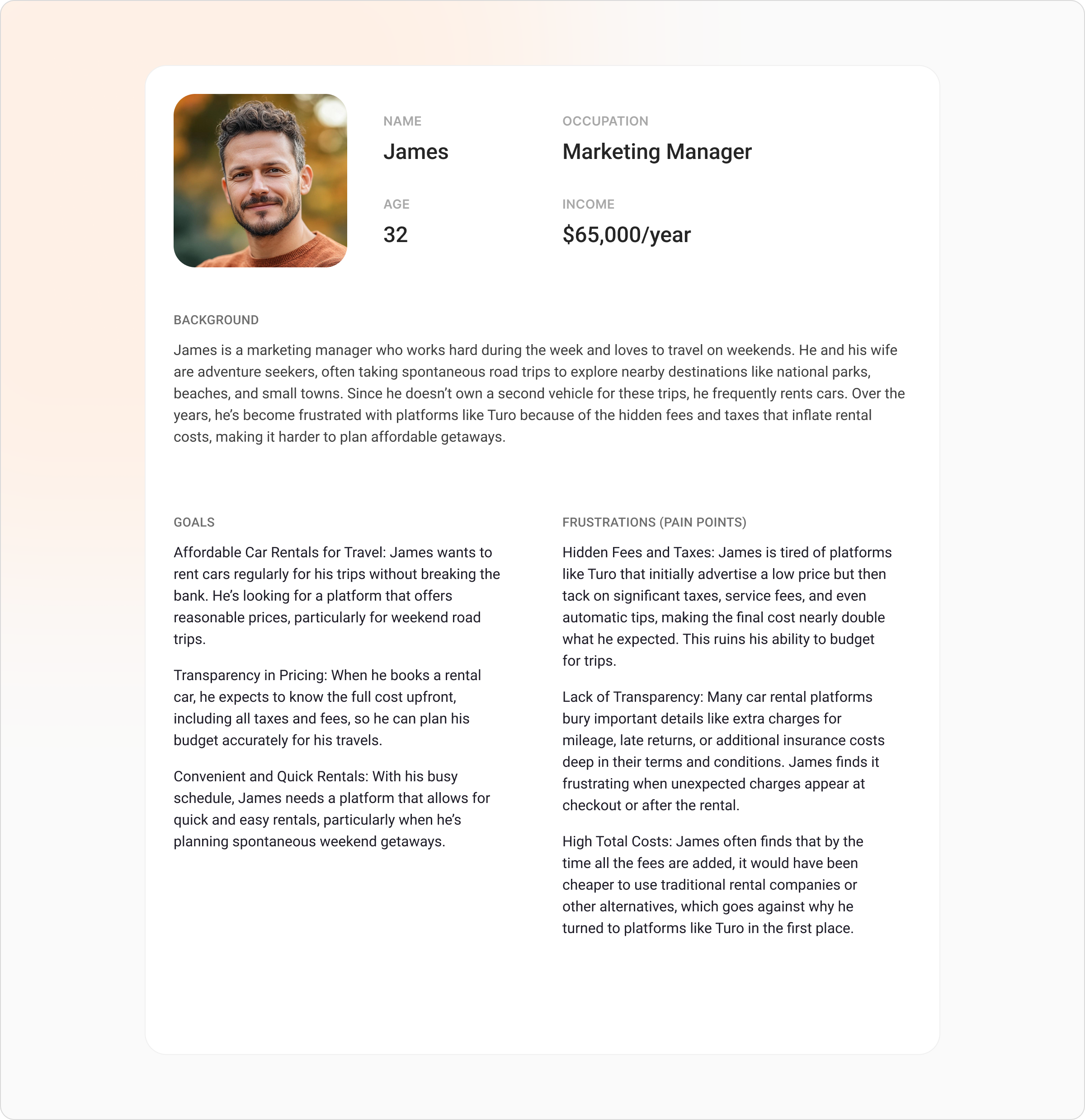
To create this user persona, we conducted a combination of qualitative interviews and online surveys with frequent car renters, traditional rental companies, and ride-sharing services. Participants, including professionals who travel regularly for work and leisure, were asked about their experiences, frustrations, and needs regarding car rentals. Key insights came from understanding pain points related to hidden fees, taxes, and unclear rental terms, which led to developing a persona that accurately reflects the concerns of individuals like James. Additionally, we analyzed customer reviews and complaints from popular rental platforms to further validate the identified issues and inform the development of this persona.
Competitor analysis

Strengths
Well-established peer-to-peer car rental platform with a wide variety of vehicle options and a large user base. Offers convenient mobile app and flexibility for both renters and owners.
Weaknesses
Common complaints include high taxes, hidden fees, and inconsistent pricing, which often frustrate users, especially frequent renters.

Strengths
Provides instant car rentals with keyless entry technology, allowing renters to unlock cars directly through the app. Focuses on short-term, flexible rentals in urban areas.
Weaknesses
High insurance fees and additional costs often confuse users, and the platform has been criticized for limited car availability in some locations.

Strengths
Trusted, established brand with clear pricing structures and a wide range of vehicles available at airports and city locations. Offers loyalty programs for frequent renters.
Weaknesses
Tends to be more expensive upfront, with rigid rental terms and additional fees for younger drivers or late returns, which limits flexibility compared to peer-to-peer platforms.
User flow
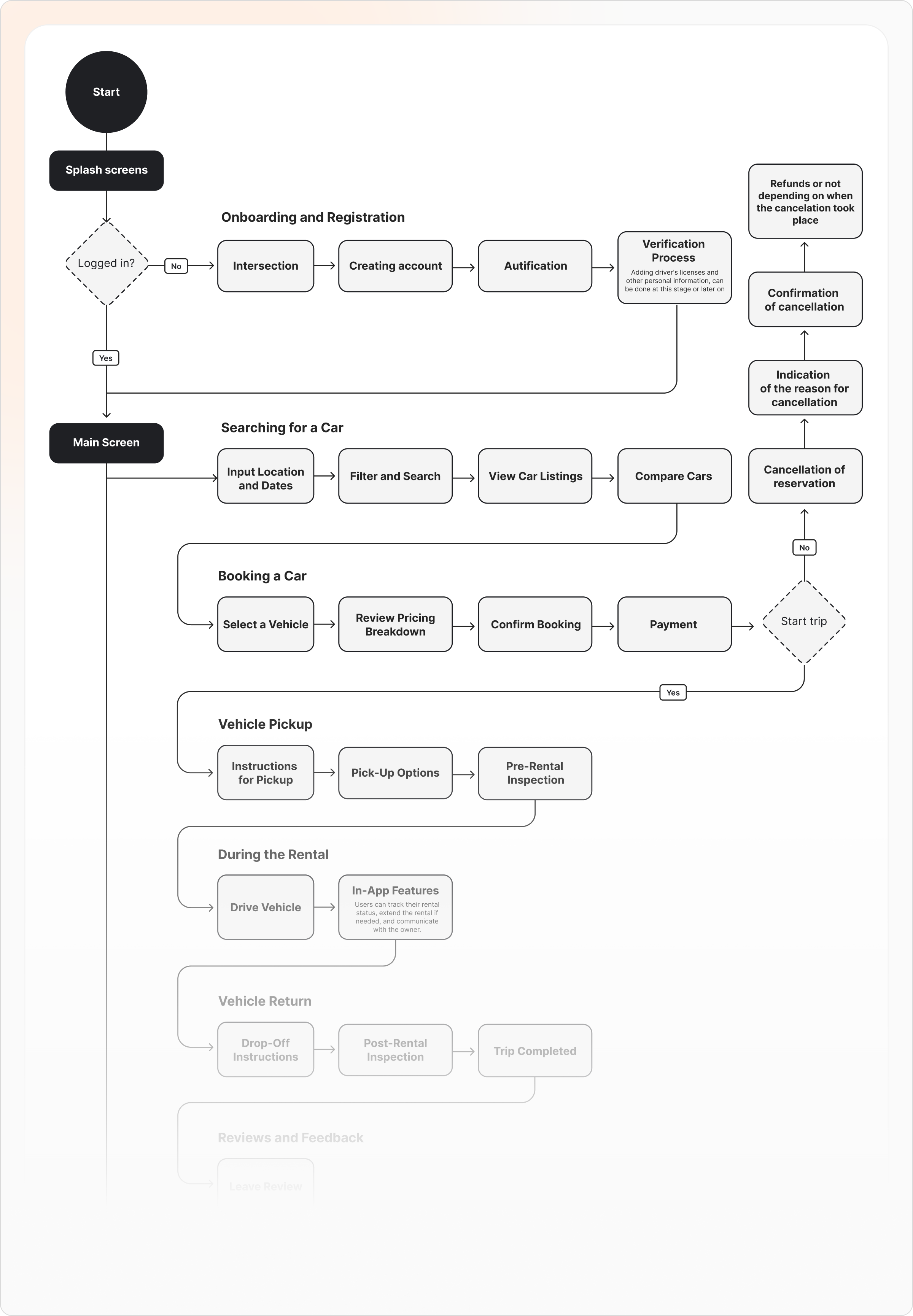
This user flow outlines the step-by-step process from the initial splash screen through onboarding, registration, and verification, leading to the completion of a car rental. The goal is to create a smooth and user-friendly experience, ensuring that each step is intuitive and efficient, minimizing friction for new and returning users.
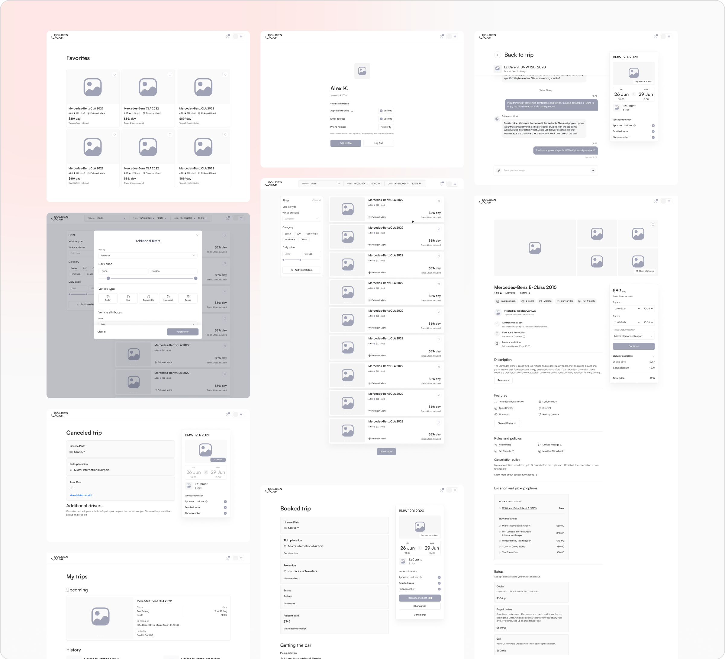
Low fidelity design
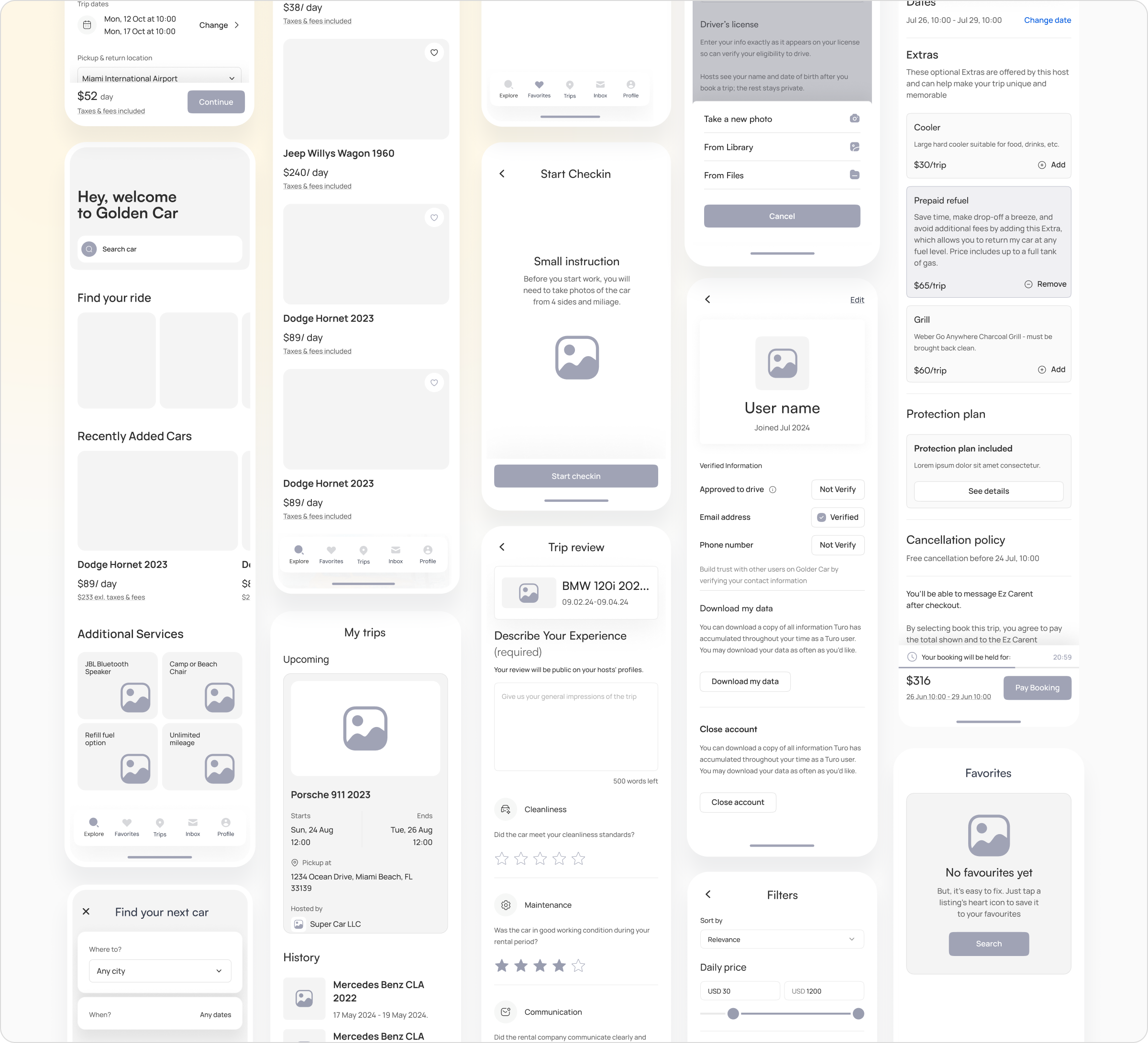
The low fidelity wireframes for the mobile application highlight the key screens and user interactions within the car rental platform. These wireframes focus on the core functionalities, including browsing available vehicles, managing bookings, and completing the check-in process. The design ensures that all essential information is easily accessible, providing a clear and intuitive experience for users as they navigate through the app.
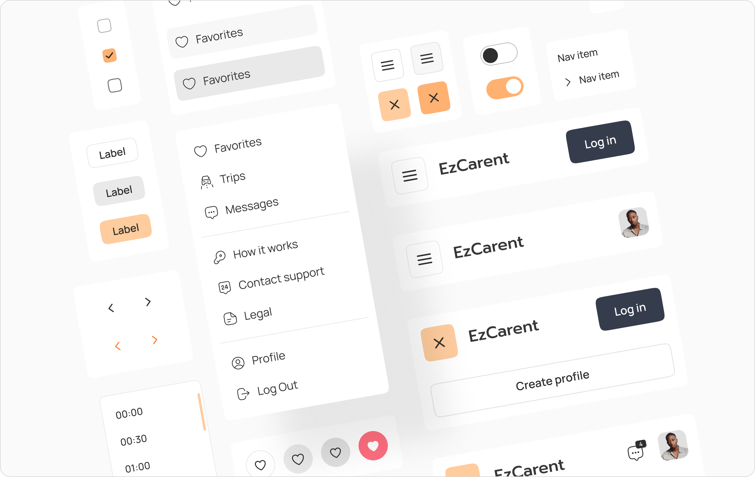
Design system
The design system establishes the visual and functional framework for the entire car rental platform. It includes a consistent set of UI components, typography, color palettes, and iconography, ensuring a cohesive and intuitive user experience across the web and mobile applications. The system promotes efficiency in design and development, allowing for rapid prototyping and scaling while maintaining brand consistency.
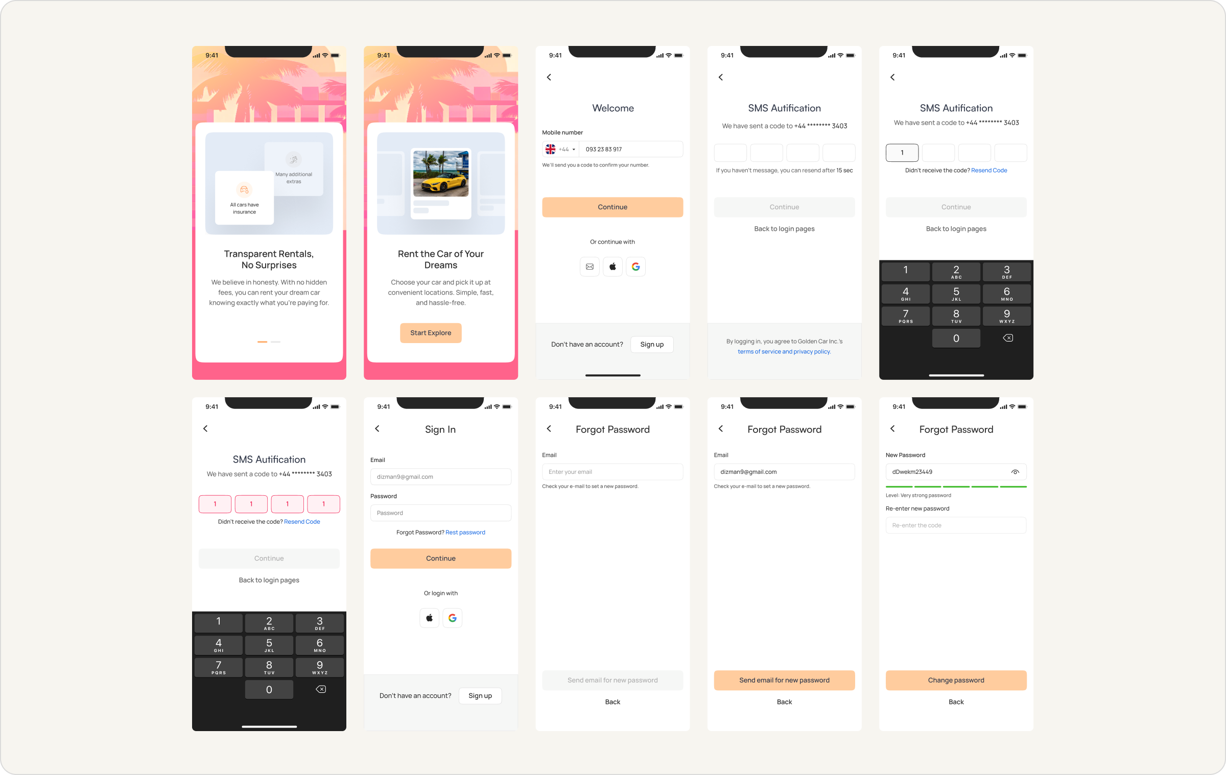
High fidelity design
We crafted over 80 screens for the mobile and web versions of the platform, ensuring a polished and cohesive user experience. These screens are optimized for usability and aesthetic appeal, providing a seamless journey from browsing cars to completing a rental.
Onboarding process
The onboarding process was designed to ensure a smooth and intuitive entry for users into the platform. It includes key steps such as signing up, SMS authentication, and password recovery, all crafted to provide a seamless experience. With a focus on user-friendly design and clear instructions, the onboarding flow helps users quickly and efficiently get started, rent cars, and manage their profiles, while ensuring secure and transparent interactions.
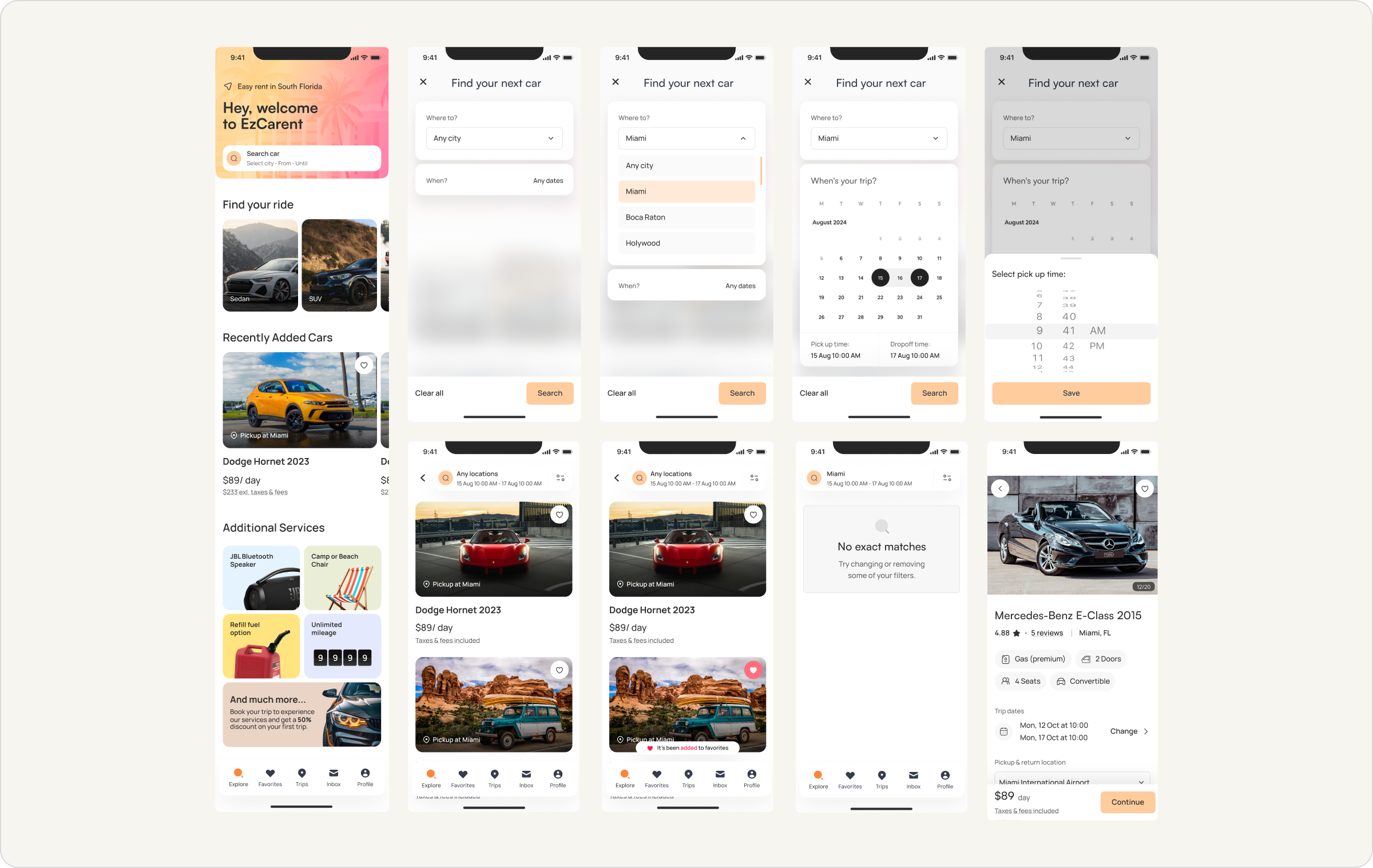
Search process
Car search
The car search process is designed to be flexible and user-friendly, allowing users to easily find their desired vehicle. Users can filter their search by location, date, and time, ensuring they get the most relevant results. The system also provides clear options for additional services and features detailed car listings, including pricing and availability. Whether searching for a short-term rental or an extended trip, this process ensures that users can quickly locate and book the perfect vehicle for their needs.

Cross platform
Web application
The design is optimized for a larger screen, providing a clear and intuitive user experience while maintaining consistency with the mobile version. Users can easily access their trip details, chat with support, and handle any modifications to their bookings with ease.

Conclusion
We worked at a rapid pace, successfully designing the entire platform in just two months. Every morning, we held meetings with developers and managers to ensure alignment and address any dependencies. This close collaboration with the development team allowed us to quickly iterate and deliver a large number of screens for the desktop, responsive, and mobile applications. The team’s ability to adapt and communicate efficiently was key to our success, ensuring the platform met all functional and design requirements within the tight timeline.